Preview image. Unlock full-res
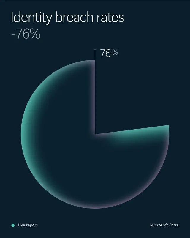
Dark navy data slide where a single teal-to-lilac gradient pie with a 76% wedge removed carries the whole "Identity breach rates" statistic.
More like this
See all

Summary
A dark data panel built around one gradient pie chart, where a missing wedge and a single percentage carry the entire message.
Visual description
The ground is a deep desaturated navy. Top left, "Identity breach rates" is set large in near-white light sans-serif, with "-76%" beneath it in the same face in mid grey. Centred below sits a large circle filled with a soft gradient running from teal at the left edge through near-black in the middle to a pale lilac sheen at the lower right, giving it a subtly spherical feel. A wedge is cut from the upper right, its edges drawn as clean straight radii with a thin light keyline on the vertical, and the label "76 %" sits just outside the cut in white with the percent sign raised smaller. Along the bottom, a small teal dot precedes "Live report" at the left, and "Microsoft Entra" sits at the right. There are no gridlines, legend or axis.
Key takeaway
A single-value pie works when the removed wedge is the story, and filling the disc with a soft gradient rather than a flat tint turns a plain chart into a brand object. Repeating the figure once as a headline and once as a chart label means the slide reads from across a room and up close.
Reuse notes
Good for report covers, keynote stats and social cards where one number matters more than a dataset. Do not extend the treatment to multi-series charts; the gradient fill would make adjacent slices unreadable. The mid-grey subhead is low contrast on navy, so lift it if the asset needs to meet accessibility targets.
More like this





Keep what you find
A free account saves references to boards and can send you a weekly email of picks based on what you save.
To see every result, go Pro.