Preview image. Unlock full-res
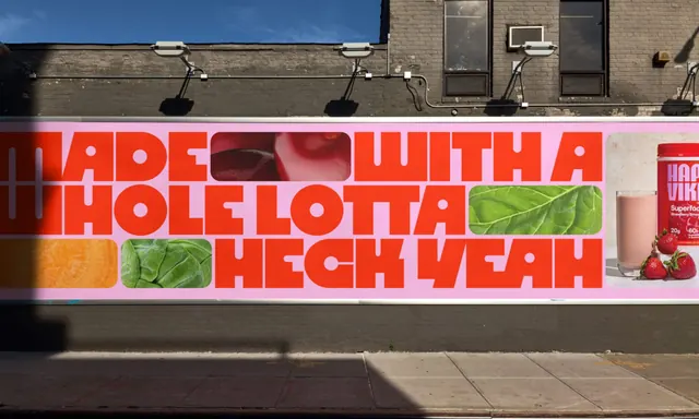
A long pink wallscape with a red display headline whose letter counters are filled with cropped fruit and vegetable photography.
More like this
See all

Summary
A wide horizontal wall ad in pink and red where the headline is the whole layout, with rounded photo crops slotted into the empty spaces inside and between the letters.
Visual description
The panel runs the full width of a grey painted brick building at street level, below a row of gooseneck spotlights and a first floor with dark window frames. The ground is a flat bubblegum pink held inside a thin cream border. Three lines of a heavy geometric display face in bright red read "MADE WITH A / HOLE LOTTA / HECK YEAH", set in tight all-caps with almost no leading so the lines lock together as one mass. Rounded-corner rectangles carrying macro food photography are dropped into the gaps in the line: sliced red cherries after "MADE", a green chard leaf after "LOTTA", and an orange citrus crop plus a cabbage crop tucked under the first line at the left. At the far right the panel ends with a lifestyle still of a pink smoothie in a glass, whole strawberries and a red product tub in the same brand type. The letterforms themselves are simple and near-monolinear with perfectly circular counters, which is what lets the photo tiles sit in the type without looking pasted on. Pavement, kerb and a hard diagonal shadow occupy the lower third of the frame.
Key takeaway
Treating the negative space inside a headline as a photo container turns a one-line message into the product shot, so the wall needs no separate imagery block. Pairing a soft pink ground with a hot red type colour keeps the piece loud while staying appetising rather than aggressive.
Reuse notes
Good reference for out-of-home or web hero work where the copy line is short and confident and the product is visually appealing at macro scale. Needs a typeface with generous, geometric counters to work, and the photo crops must be colour graded against the ground or they fight the type. The long letterbox proportion makes this hard to reuse in portrait formats without rewriting the line breaks.