Preview image. Unlock full-res
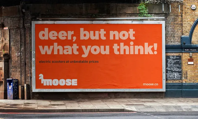
Street billboard for the e-scooter marketplace Moose, an orange field carrying a two-line oversized headline with the animal logotype locked bottom left.
More like this
See all
Summary
A 48-sheet billboard pasted into a brick railway arch, filled edge to edge with flat orange and one oversized conversational headline. The whole panel is a single colour block doing the work that imagery usually does.
Visual description
The poster is a solid orange rectangle set inside a weathered metal billboard frame, photographed straight on with the pavement, kerb and a neighbouring pizzeria chalkboard in frame. Two lines of very heavy rounded sans read "deer, but not what you think!" in a soft pinkish off-white that sits only a step away from the orange, so the type reads as tonal rather than shouted. A single line of small dark sub-copy underneath states "electric scooters at unbeatable prices". The bottom left corner carries the white Moose logotype, where the leading letterform doubles as a four-legged animal silhouette, and the bottom right corner carries "moose.co" in the same white. Paper texture, seams and a slight bubble in the paste are all visible, and the surrounding brickwork is a muted brown.
Key takeaway
Setting the headline in a tint of the background colour rather than in white keeps a very loud orange from becoming aggressive, and reserves pure white for the two brand assets that must be found instantly. The joke lands in two lines with no image support at all.
Reuse notes
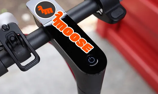
Good reference for out-of-home work where one flat brand colour has to hold an entire panel, and for consumer brands leaning on conversational copy. The tonal headline needs a big surface to survive; at small sizes the contrast between headline and field would fall apart. Pairs naturally with the tighter logo and merchandise frames from the same identity.