Preview image. Unlock full-res
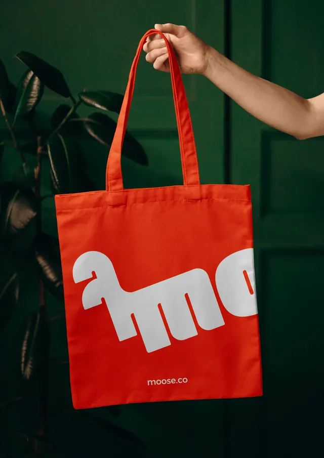
An orange cotton tote held up against a dark green door, printed with the Moose logotype blown up so large that it runs off both edges.
More like this
See all
Summary
Merchandise treated as a crop: the logotype is scaled up until only the animal letterform and two following characters fit on the bag, with the url set small underneath to carry the name.
Visual description
A portrait photograph of a bare arm holding an orange cotton tote by its self-coloured handles, in front of a dark green panelled door with a glossy rubber plant filling the left edge. The print sits across the lower two thirds of the bag in a chalky off-white: the animal letterform complete at left, then two more letters that run off the right edge of the panel, so the word is unreadable as text and reads instead as a large graphic silhouette. Below the crop, centred and much smaller, "moose.co" appears in a light rounded sans. The canvas weave breaks up the ink slightly, the fabric hangs with soft vertical folds, and the lighting is directional from the right, leaving the door and plant in near shadow.
Key takeaway
Cropping the logotype past legibility works because the url underneath does the naming, so the big shape is free to behave as pattern rather than as a signature. Photographing warm orange against deep green also demonstrates the palette's strongest complementary pairing without ever putting green in the identity.
Reuse notes
Good template for merchandise, packaging panels or any surface where the mark can be treated as artwork instead of a lockup. Only safe once the brand has some recognition, or with a small legible fallback as used here. The dark green backdrop is doing a lot of the work in the shot and would need substituting for in-store or on-white contexts.
More like this



Keep what you find
A free account saves references to boards and can send you a weekly email of picks based on what you save.
To see every result, go Pro.