Preview image. Unlock full-res
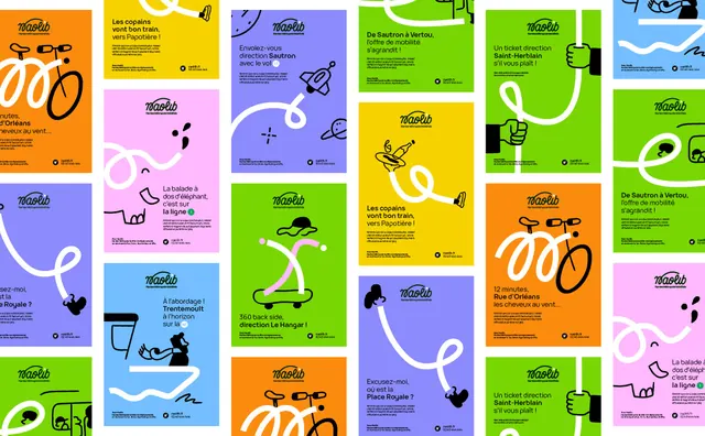
Tiled wall of transit posters in flat saturated colours, each built from a script wordmark, a short French headline and a single white looping line that turns into a doodle.
More like this
See all

Summary
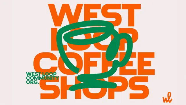
A dense staggered wall of portrait posters showing the same layout template recoloured across six flat brand colours, with one white line doing all the illustration.
Visual description
Posters are tiled in offset vertical columns with thin white gutters, so the grid reads as a continuous surface rather than separate sheets. Backgrounds alternate between orange, yellow, hot pink, periwinkle, mid blue and acid green. Every poster carries the same furniture: the "naolib" script wordmark at the top with the small descender line "Nantes Métropole Mobilités" under it, a two or three line headline in a geometric sans mixing regular and bold weights to emphasise a destination, a small block of grey body copy, and a footer with a circular monogram badge next to a URL and phone number. Cutting through each poster is a single thick white line that loops and doubles back before resolving into a subject drawn in black: a bicycle, an elephant, a skateboarder mid trick, a fist gripping a tram strap, a small rocket, a hand pouring from a bottle. Some headlines are punctuated by a small coloured circle or capsule holding a line number. The illustrations are loose and hand-drawn, sitting deliberately against the tight typographic block.
Key takeaway
One structural device, a white line that starts as an abstract loop and ends as a recognisable object, lets a whole campaign vary its message and colour while staying instantly identifiable. The template never moves; only the colour, the headline and the object at the end of the line change.
Reuse notes
A strong model for a public service or transit campaign that has to run for years across many messages. Works best when the palette is wide enough to keep a poster wall from banding, and when the illustration style is loose enough that new subjects can be added cheaply. The lorem body copy here means the real reading order below the headline is untested.