Preview image. Unlock full-res
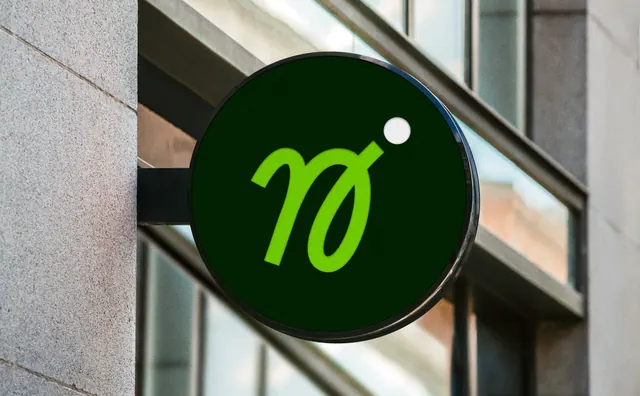
Circular projecting sign on a glass and stone facade, carrying the brand's lime script monogram with its detached dot on a dark green disc.
More like this
See all

Summary
The brand reduced to a single script monogram, mounted large and centred on a dark green disc that projects from a building corner.
Visual description
A circular sign hangs on a short black bracket off a pale stone pier, seen at a slight angle so its glossy black rim catches highlights from the glazing behind. The face is a deep forest green. Filling most of it is a lowercase "n" drawn in a thick brush-script with an open, looping bowl that reads almost as an "o" fused to the stem, rendered in a bright acid lime. A solid white circle sits detached at the upper right of the letterform, standing in for a dot and breaking the otherwise green and lime pairing. Behind the sign, a modern facade of glass curtain walling and a diagonal soffit runs out of focus, with strips of grey mullion and reflected sky.
Key takeaway
Cropping a script wordmark down to its first character keeps the brand's handwritten warmth at the small, high-contrast scale signage demands. The white dot is the whole trick: one off-palette element that fixes the mark's orientation and gives the eye somewhere to land.
Reuse notes
Reach for this when a script logotype needs a compact form for signage, app icons, stickers or badges. Requires a letterform distinctive enough to survive losing the rest of the word. The dark disc gives the lime enough contrast to read against bright sky, which a light-coloured face would not.