Preview image. Unlock full-res
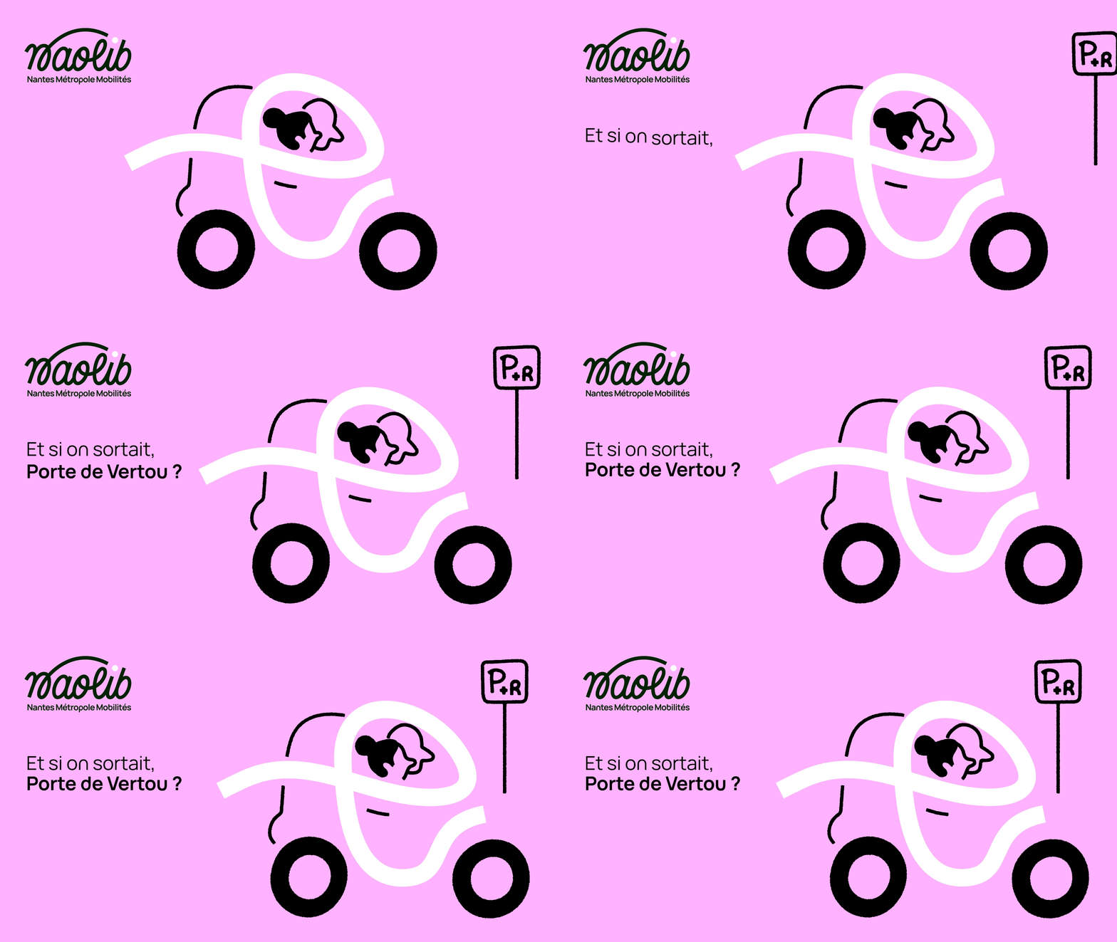
A pink transit campaign frame where a scooter and rider drawn as one white ribbon sit beside a park and ride sign while the French line builds word by word.
More like this
See all

Summary
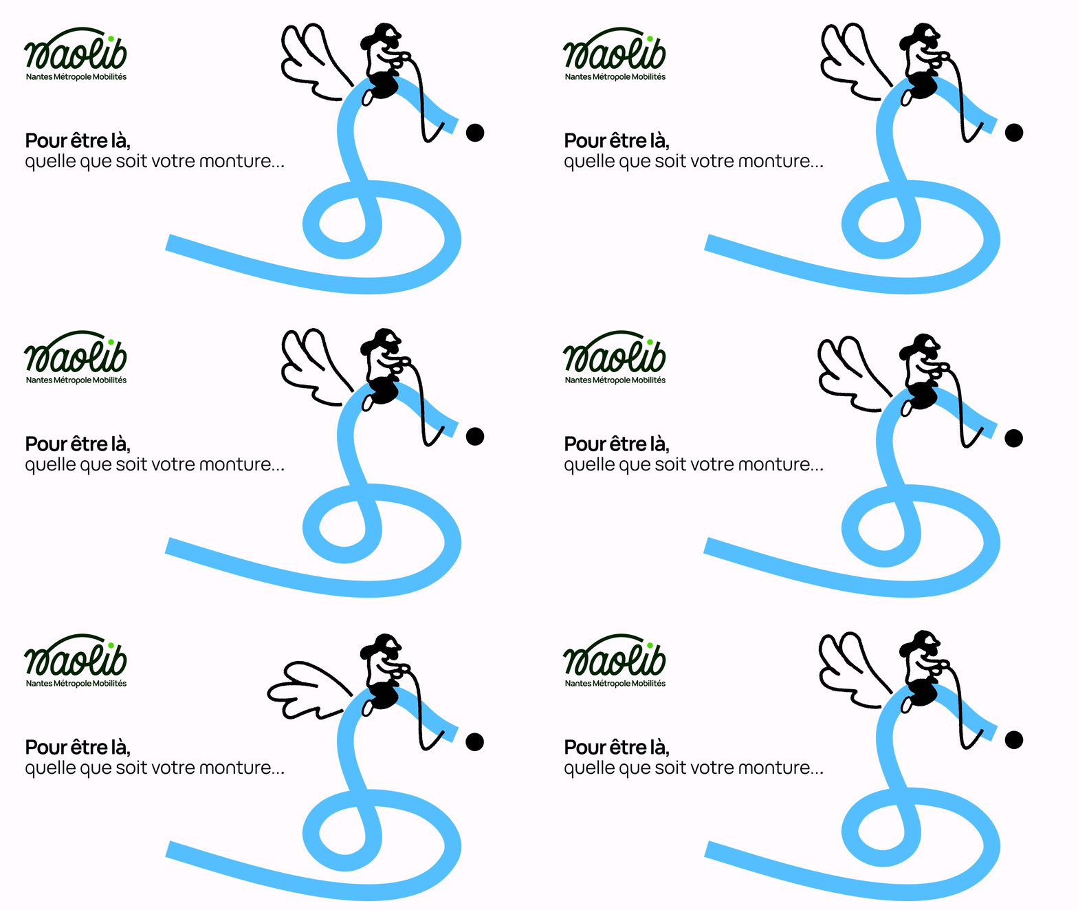
A flat pink campaign frame whose vehicle is drawn as a single thick white ribbon, with the French invitation typing on in two beats and a park and ride sign rising beside it.
Visual description
The ground is a flat pastel pink that fills the frame. The brand lockup sits top left: a dark script-flavoured wordmark under a swooping stroke, with a small all-caps authority line beneath. Below it the copy builds in two stages, an opening fragment in regular weight and then a bolded place name closing with a question mark. The right side holds the illustration: one continuous fat white ribbon loops to describe the scooter's body, seat and headlamp shroud, with a rider's head and shoulders formed in the same white against solid black hair and face shapes. Two heavy black rings serve as wheels, a thin black line arcs up as the handlebar, and a short black dash sits on the fairing. To the right a black outlined post carries a square sign with a boxed P and a small plus and R, reading as a park and ride marker. Across the loop the sign and the copy arrive in sequence while the vehicle itself stays fixed, so the frame resolves into the full lockup and holds.
Key takeaway
The single unbroken white ribbon that becomes vehicle, seat and rider at once is the identity's core device, and it survives translation from one mode of transport to another. Letting the roadside sign appear as part of the sentence rather than as decoration ties the illustration to a real service.
Reuse notes
Reach for this when a mobility or place brand needs one drawing system across many modes and destinations, each frame recoloured to a different flat ground. The ribbon technique needs a designer who can keep a constant stroke width through tight curves. Pale pink with black artwork is legible on screen but check the contrast of the thin sign strokes before printing at small sizes.
More like this

Keep what you find
A free account saves references to boards and can send you a weekly email of picks based on what you save.
To see every result, go Pro.