Preview image. Unlock full-res
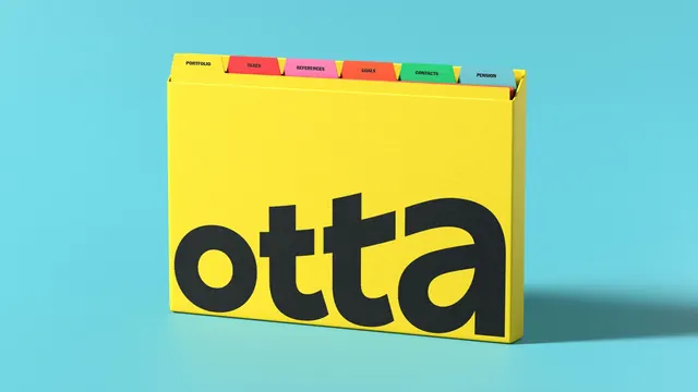
A rendered yellow card-filing box on a pale cyan ground, carrying an oversized black lowercase "otta" and six coloured index tabs across its top edge.
More like this
See all

Summary
A flat yellow card-filing box shown in three-quarter view against pale cyan, branded with an oversized lowercase "otta" and topped by a row of six differently coloured index tabs.
Visual description
The background is a smooth pale cyan with a soft gradient and a faint contact shadow pooling under the object, which sits centered and turned slightly so its right side face is visible. The box itself is a saturated warm yellow with a matte paper grain, proportioned like a wide shallow card index rather than a document box. Across the front face, the word "otta" runs nearly edge to edge in near-black lowercase: a heavy geometric sans with a perfectly round o, flat-topped double t whose crossbars merge into a single continuous stroke, and a wide single-storey a. The type is cropped tight to the box edges so the letters dominate the whole panel. Rising above the top edge are six divider tabs in a left-to-right run, each a different flat colour: the first tab matches the box yellow and reads PORTFOLIO, followed by red TAXES, pink REFERENCES, orange-red GOALS, green CONTACTS, and slate blue PENSION. All tab labels are small, bold, black, and all-caps, set centered on each tab. A thin red card edge peeks out from inside the box at the right, hinting at contents.
Key takeaway
The brand asset here is an object, not a layout: a familiar piece of analogue organisation gets the logotype at poster scale, and the divider tabs turn the brand palette into a functional colour-coding system with real labels rather than a swatch row. Because each tab names a distinct category, the palette is arguing that the brand sorts a messy set of concerns into one tidy container.
Reuse notes
Strong reference for identity key visuals that need to explain a product's job without a screenshot, and for showing a multi-colour secondary palette doing work instead of sitting in a grid. It depends on a competent render with believable paper texture and a single soft shadow, since the concept collapses if the object looks plastic or floating. The complementary yellow-on-cyan pairing is loud, so pair it with quieter frames elsewhere in the same system.
More like this


Keep what you find
A free account saves references to boards and can send you a weekly email of picks based on what you save.
To see every result, go Pro.