Preview image. Unlock full-res
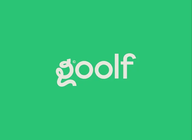
Cream lowercase "goolf" wordmark centered on flat emerald green, with the g descender curling into a club-shaped hook.
More like this
See all
Summary
A single-weight lowercase wordmark sitting alone on a flat green field, its opening letter drawn as a continuous loop that hooks out to the left along the baseline.
Visual description
The full frame is one flat mid-green with no gradient, texture or edge. Centered and slightly above the optical middle sits the word "goolf" in a soft cream, set in a rounded geometric sans with even stroke weight and generous counters. The o, l and f are conventional. The g is redrawn: its bowl is a closed loop that continues down and swings out to the left in a long curved tail, ending in an upturned flick, so the descender reads as a club head or a hook rather than a normal g tail. A tiny circled copyright mark sits as a superscript in the gap between the g and the first o. Nothing else appears in the frame, and the spacing around the word is very wide on all sides.
Key takeaway
One customized letterform carries the entire concept, so the rest of the wordmark can stay quiet and highly legible. The oversized clear space and the two-color limit make the mark feel confident rather than cute, which is what keeps a pun name from reading as a joke.
Reuse notes
A good reference for consumer app brands that want warmth without illustration, and for logos that must survive at small sizes in an app icon or a shirt embroidery. The looped g needs enough size for the tail to stay readable; below about 24 pixels it fills in. Cream on green is a soft contrast pair, so check it against accessibility minimums before using it for interface text.