Preview image. Unlock full-res
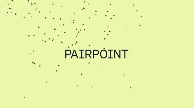
The Pairpoint wordmark set small and centered on a pale lime field, surrounded by hundreds of scattered tri-radiate glyphs that thin out toward the bottom.
More like this
See all


Summary
A pale lime field carrying the PAIRPOINT wordmark in dark monospace all-caps, centered and small, inside a drifting field of the brand's tri-radiate Y glyph.
Visual description
The ground is a flat pale yellow-green with no gradient or texture. Hundreds of small dark glyphs, each a three-armed Y with slightly clubbed tips, are scattered across it at varied rotations. Density is highest along the top edge, where glyphs cluster into short chains and clumps, and falls away steadily toward the bottom third, which is nearly empty. The wordmark sits just above center, set in a wide monospace grotesque, all caps, with even letter spacing and moderate weight, occupying only about a third of the frame width. Glyphs pass close to the wordmark on both sides but none overlap it, so a small clear zone reads as deliberate. There is no other text, rule or containing shape.
Key takeaway
Sizing the wordmark small inside a busy field makes it feel like a marker on a map rather than a badge, which suits a network brand. The top-heavy scatter gives a static frame a direction of travel without any motion effect.
Reuse notes
Reach for this as a title card, cover, or loading state where the logo needs air but the frame should not feel empty. Depends on a glyph simple enough to repeat hundreds of times without turning into noise. The wordmark is small here, so it needs reasonable viewing size and will not survive heavy downscaling.
More like this


Keep what you find
A free account saves references to boards and can send you a weekly email of picks based on what you save.
To see every result, go Pro.