Preview image. Unlock full-res
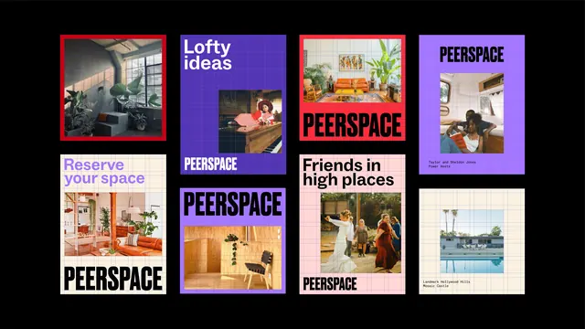
Eight Peerspace poster layouts arranged on black, each showing its underlying baseline grid beneath a heavy all-caps wordmark and a cropped interior photograph.
More like this
See all
Summary
A layout system shown as eight sibling posters on black, each one leaving its construction grid visible so the rules governing wordmark, image and caption are readable at a glance.
Visual description
Landscape frame, pure black background, eight portrait and square panels staggered in four loose columns with uneven vertical offsets. Every panel carries a faint blue line grid over its coloured field, and the photographs are cropped to grid units. Colourways cycle through violet, lavender, tomato red, blush pink and warm cream. Recurring elements: the wordmark "PEERSPACE" set in a very heavy grotesque, all caps, tight tracking, stretched to the full measure and placed at either the top or the bottom of the panel; a single cropped colour photograph of an interior or an event, always smaller than the panel and never bleeding; and in two panels a short headline in the same grotesque at a smaller size, reading "Lofty ideas" and "Friends in high places". Two panels replace the headline with a two-line monospace caption naming a host or a venue. Photographs show a plant-filled loft, a person at a piano, an orange sofa in a patterned room, a couple reading in a camper van, a terracotta living room, a plywood interior with a black chair, a group dancing outdoors, and a poolside bungalow. A red keyline frames one photograph and one whole panel.
Key takeaway
Leaving the grid visible turns a set of finished posters into a demonstration of the system, which is far more persuasive in an identity case study than clean comps. Locking the wordmark to full measure at a fixed edge, then letting colour, crop and caption vary, is what makes eight different panels read as one family.
Reuse notes
A good model for marketplace, venue or events brands that need a flexible social and poster kit rather than fixed templates. Works because the photography is warm, editorial and consistently colour-graded, so the system would weaken with mixed-quality user photos. The exposed grid is a presentation device, not something to ship on the live artwork.
More like this




Keep what you find
A free account saves references to boards and can send you a weekly email of picks based on what you save.
To see every result, go Pro.