Preview image. Unlock full-res
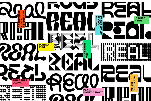
A wall of the REAL wordmark redrawn a dozen ways in black on white, with flavor labels in bright blocks scattered between them.
More like this
See all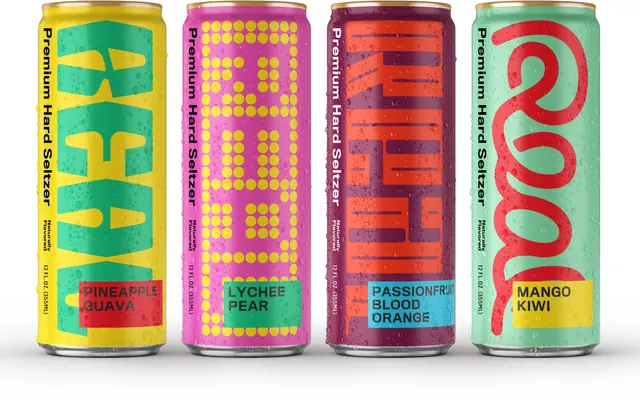
Summary
The full set of REAL lettering variations laid out as a black-on-white tiled field, punctuated by small colored flavor labels.
Visual description
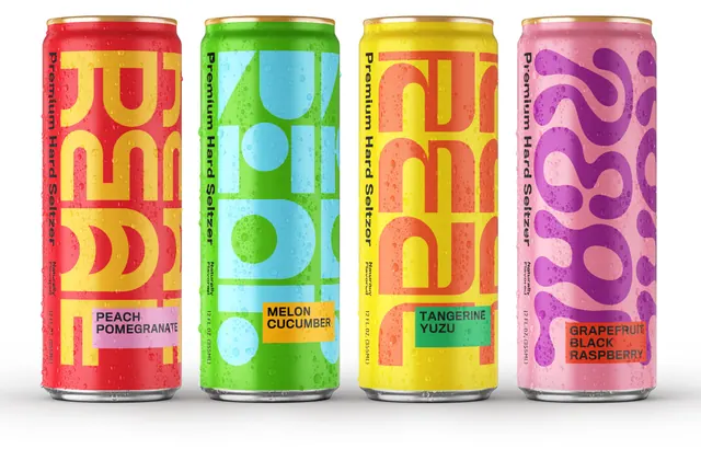
The word REAL repeats across the frame in black at large scale, cropped at every edge, each instance drawn differently: a soft looping cursive, a heavy chiseled cut with angled joints, a wide bubbly rounded version, an inline treatment where each letter is filled with concentric strokes, a dot-matrix built from solid circles, a version constructed from triangles and diamonds, a tall condensed cut, a mirrored or reversed setting, and a stencil-like broken form. They tile at varying angles and scales with no consistent baseline, so the field reads as pattern. Scattered over them are eight small rectangular labels in flat brights, orange, cyan, green, yellow, pink, magenta and coral, each carrying a flavor in small black caps: Grapefruit Black Raspberry, Passionfruit Blood Orange, Lychee Pear, Mango Kiwi, Tangerine Yuzu, Pineapple Guava, Peach Pomegranate, Melon Cucumber. Several labels are rotated to run vertically.
Key takeaway
Showing the whole lettering library at once is the argument for the identity: one four-letter word, a dozen incompatible drawing styles, still unmistakably one brand. The tiny colored flavor labels are the only fixed element, and they do all the ordering work in an otherwise deliberately chaotic field.
Reuse notes
A strong model for a wordmark-only identity that needs variety across many SKUs, and directly usable as a wrapping paper, secondary surface or case-study opener. It is a specimen, not a layout: it has no hierarchy and no entry point, so it needs a plain headline surface next to it. Only viable when the brand name is short enough to survive being redrawn this many times.