Preview image. Unlock full-res
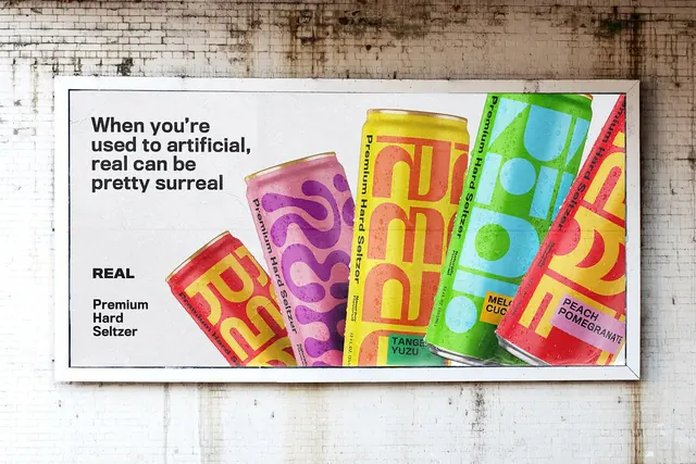
Pasted billboard on a white brick wall pairing a black sans headline with five fanned seltzer cans in clashing fluorescent colorways.
More like this
See all
Summary
A white-framed billboard photographed flat against a weathered white-painted brick wall, splitting its field between a plain black headline and a fan of five seltzer cans in five different fluorescent colorways.
Visual description
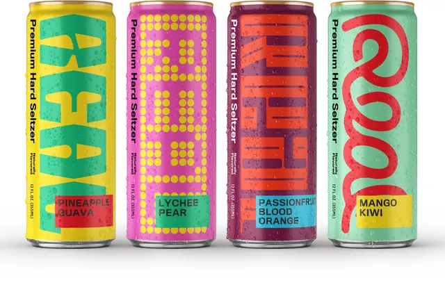
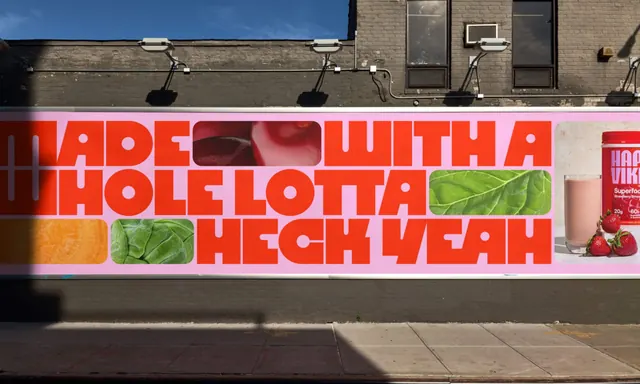
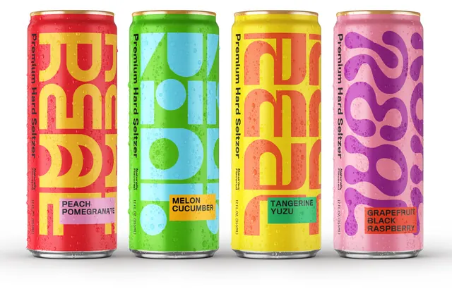
The poster field is off-white newsprint. On the left, four lines of heavy black sans-serif read "When you're used to artificial, real can be pretty surreal", set tight with almost no leading. Below it, after a deliberate gap, the REAL wordmark sits small and bold, then "Premium Hard Seltzer" stacked on three lines in the same face at a lighter weight. The right two-thirds carries five condensation-beaded cans splayed in a rising diagonal fan, each cropped off the bottom edge. The can graphics crop the REAL letterforms so large that only fragments of the R, E, A and L read: red with yellow type, pale pink with purple squiggles, yellow with orange, green with cyan geometric shapes, and red with yellow. Small colored flavour chips label them TANGERINE YUZU, MELON CUCUMBER and PEACH POMEGRANATE. "Premium Hard Seltzer" runs vertically up each can's left edge. The surrounding brick, streaked with grime and moss, frames the pristine poster.
Key takeaway
Blowing the wordmark up until it crops off the can is the whole idea: the mark becomes pattern at product scale and stays recognizable as a family across five unrelated color pairs. The headline is left completely unstyled so the cans carry all the noise.
Reuse notes
Good reference for CPG out-of-home where a range needs to read as one brand while each flavour keeps a distinct color signature. The crop-the-logo move needs a short, geometric wordmark to survive it. Works because the background is neutral and grubby, giving the fluorescents somewhere to sit.