Preview image. Unlock full-res
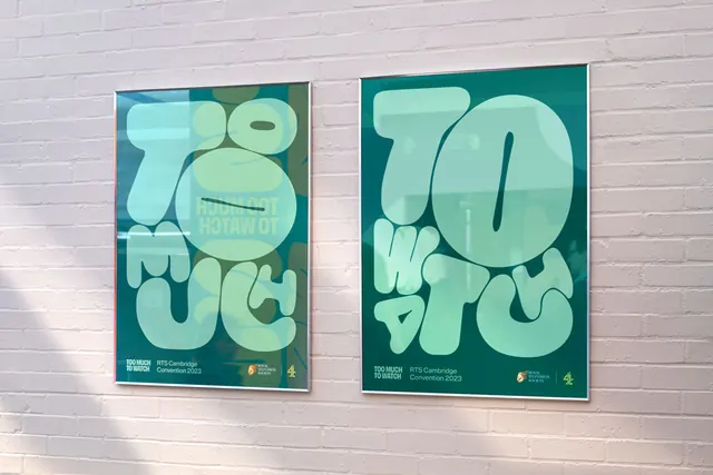
Two framed portrait posters mounted on white brick, each cropping the same bubble-lettered phrase at a different scale in tonal green.
More like this
See all

Summary
A two-poster set showing how far the lettering can be zoomed before it stops working, both sheets kept to a single green family so the type does all the work.
Visual description
Two thin silver frames hang side by side on a white-painted brick wall, lit by raking daylight that throws a soft diagonal shadow across the left edge. The left poster is a mid teal-green field with pale mint letterforms cropped hard by the sheet edges, plus a smaller inverted repeat of the phrase set in a light green disc near the top. The right poster crops in further: three or four enormous rounded letters fill the whole sheet, one perfect circle with a diagonal bar at its centre dominating the upper half. Both posters carry the same footer band, a small all-caps two-line title at the left, the event name and year in sans-serif beside it, and the Royal Television Society crest paired with the broadcaster mark at the right. Reflections in the glass are visible and left in.
Key takeaway
Running the same lettering at two crop levels across a pair gives a series instantly, with no second idea required. The tone-on-tone green keeps very large type quiet enough to hang indoors.
Reuse notes
Useful for event, exhibition, and gallery poster families where a single typographic asset has to fill many sizes. Only works when the letterforms are distinctive in silhouette; a neutral grotesque cropped this hard would read as noise rather than as the phrase.