Preview image. Unlock full-res
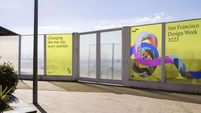
Chartreuse event posters mounted on a waterfront glass hoarding, pairing a black serif headline with a looping multicolour ribbon knot filled with city photography.
More like this
See all
Summary
Two acid yellow-green event posters applied to a run of glass hoarding panels above a bay, one carrying only a serif line of copy and the other a title lockup beside a twisting ribbon knot filled with photographic texture.
Visual description
The hoarding runs diagonally across the frame from lower left to upper right, built of frosted glass panels in white metal frames, with a pale sky, flat water and a lamp post behind it and warm paving in the foreground. The left poster is a flat chartreuse field with three left-aligned lines of black serif type reading Changing the way the story unfolds, set small and high on the sheet so most of the panel is empty colour. Near its lower right corner a compact lockup is rotated ninety degrees, with the word Plot upright and the word Twist set inverted beneath it so the pair mirrors itself; a line of tiny event details sits at bottom left. Two clear glass panels break the run in the middle. The right poster repeats the chartreuse ground and carries the same mirrored Plot Twist lockup at top left, the title San Francisco Design Week 2023 in three lines of black serif at top right, and across the lower two thirds a continuous looping ribbon that folds through itself in flat magenta, cobalt, orange and purple segments, with several of the folds filled by cropped photographs of pastel apartment blocks, palm trees and a downtown skyline. A small black mark and a date line sit at the bottom corners.
Key takeaway
The ribbon behaves as one continuous form whose facets alternate between flat brand colour and photographic fill, which lets a single graphic device carry both the identity palette and the host city. Setting the second word of the lockup upside down makes the phrase Plot Twist perform its own meaning without any extra illustration.
Reuse notes
Strong reference for festival and conference identities that need one flexible hero graphic plus a loud background colour. The chartreuse is doing most of the recognition work, so the system needs that exact colour to stay consistent across print and screen; the mirrored lockup also demands a two-word name to make sense.