Preview image. Unlock full-res
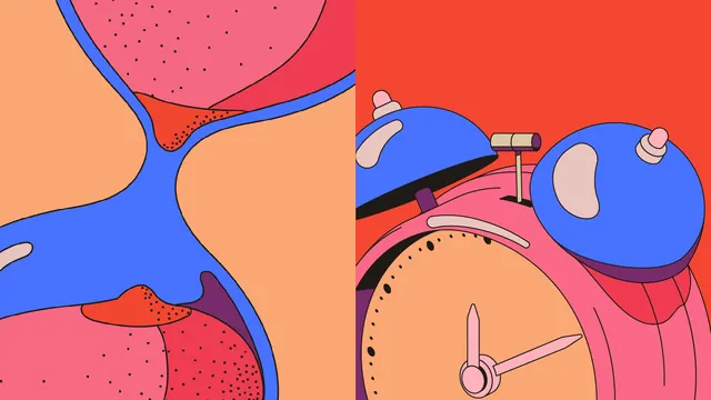
A two-up split of extreme illustration crops, one an abstract tangle of outlined organic forms, the other a close-up of a drawn alarm clock.
More like this
See all
Summary
A flat two-panel plate showing the identity's illustration language at very close range, with no type at all. Both halves are pure drawing.
Visual description
The image is split down the middle. The left half is a heavily zoomed abstract: swollen, soft-cornered shapes in peach, rose pink, cobalt blue and crimson press against each other, each bounded by a thin black contour, with two pinched red junctions dusted in fine black stipple dots. The right half is a coral-red field holding a drawn alarm clock cropped so that only its upper body fits: a peach dial with a dotted minute track and two pale pink hands, a pink case, two blue domed bells, and a small olive and purple hammer bar between them. The palette, line weight and cream highlight blobs are identical across both halves.
Key takeaway
Zooming an illustration past the point of recognition turns it into pattern while keeping the brand's exact line weight and palette. Pairing that abstract crop with one legible object in the same style shows the range of the drawing system in a single frame.
Reuse notes
Useful as a texture or background plate inside a wider identity, and as a template for a case study spread that has to prove an illustration style rather than describe it. Needs a strong outline discipline, since a soft or varied line weight would break the effect.
More like this






Keep what you find
A free account saves references to boards and can send you a weekly email of picks based on what you save.
To see every result, go Pro.