Preview image. Unlock full-res
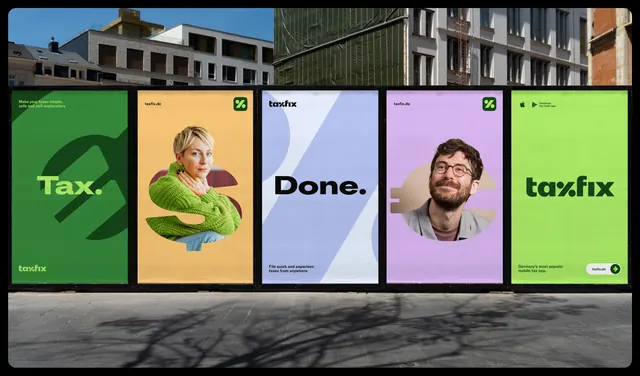
A run of five pasted street posters that shows the identity's color range, oversized percent graphics and cut-out portraits side by side.
More like this
See all
Summary
Five portrait posters pasted in a row on a construction hoarding, read as one sequence that demonstrates the palette, the percent graphic and the photography treatment in a single glance.
Visual description
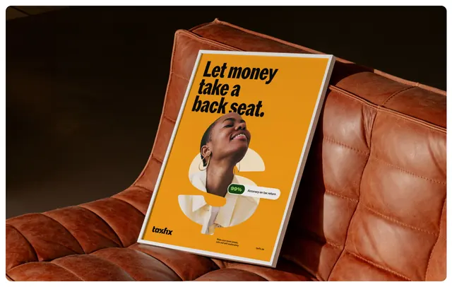
A city street scene with apartment facades and scaffolding above, paving and tree shadows below, and a black hoarding carrying five poster panels. Left to right: a deep green panel with "Tax." in lime type over a huge tonal percent glyph and the wordmark bottom left; an amber panel with a cut-out portrait of a woman in a lime knit sweater sitting inside an oversized percent form, url top left and a green icon tile top right; a pale periwinkle panel with "Done." in black display type over a large off-white percent shape and two lines of support copy; a lilac panel with a bearded man in glasses cut out over a beige percent form; and a lime panel with the wordmark set very large in dark green plus a white pill button reading the url with a circular arrow. Type is a heavy geometric sans throughout, and every panel uses the percent mark as an oversized background device.
Key takeaway
One graphic device, the percent mark blown up to poster scale, holds five very different color and content treatments together. Alternating type-led and portrait-led panels gives the run rhythm without a rigid template.
Reuse notes
Reach for this when presenting a color system or campaign flexibility in one image rather than a swatch grid. The pattern needs a distinctive single glyph to scale up. Note that the leftmost and rightmost panels are pure brand statements with no message, so a shorter run would lose the rhythm.