Preview image. Unlock full-res
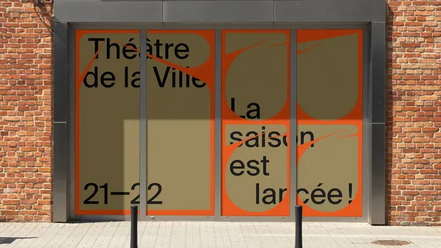
Orange and khaki season graphics applied across four glass door panels in a brick facade, with the type deliberately broken by the door frames.
More like this
See all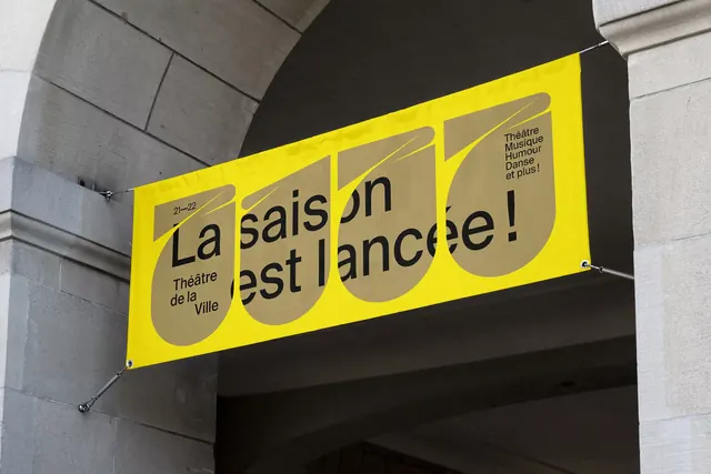
Summary
The season identity applied as full-height window graphics on a theatre entrance, where the door mullions cut through the headline and the shape system carries across the gap.
Visual description
A recessed glazed entrance sits in a red brick wall, with a brushed metal surround and pale paving in front. Four tall glass panels are covered edge to edge in graphics. The two left panels are orange with a large khaki teardrop filling most of the area; black lowercase type reads Théâtre de la Ville over two lines near the top, with an orange spike slashing diagonally through it, and 21-22 set large at the foot. The two right panels reverse the relationship, showing khaki teardrop shapes on orange with black type reading La saison est lancée! stacked over three lines, again crossed by thin orange spikes. Because the type runs continuously across the panels, the vertical metal mullions slice through several words, and the letters simply resume on the next panel. Hard afternoon sun falls across the lower left of the glass and two black bollards stand in the foreground.
Key takeaway
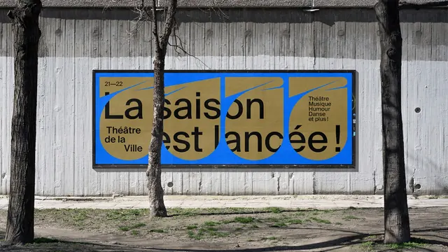
Setting the headline as one continuous run and letting the architecture cut it is what makes this read as a building rather than as posters stuck to a building. The teardrop shapes flip figure and ground between the left and right pairs, so the same two colors produce two distinct panels.
Reuse notes
Good for a venue, shop or lobby where the glazing is the largest available surface and the frames cannot be avoided. It only works when the copy is short and familiar enough to survive being interrupted, so keep essential details such as dates in an uninterrupted panel. Check sightlines, since full-coverage vinyl removes the view into the foyer.