Preview image. Unlock full-res
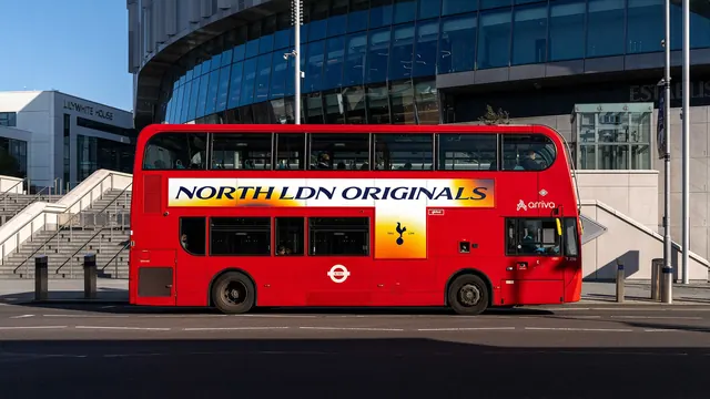
A red London double-decker carrying a white side panel with an orange gradient bleed, an italic serif North LDN Originals line and a cockerel panel below.
More like this
See all
Summary
The club campaign applied to the side of a red London bus, using the same orange heat gradient and italic serif line but splitting it into a long upper strip and a small square crest panel.
Visual description
A red double-decker bus stands in low sun on a road in front of a stadium, with a pale office block and steps at the left and a glazed entrance and flagpole at the right. Two white advertising panels are applied to the near side. The upper strip runs almost the full length between the decks: it is white with orange and yellow gradient washes bleeding in from both ends, their edges dissolving into halftone dots, and NORTH LDN ORIGINALS is set across it in large navy high-contrast italic serif caps. Below and slightly right of centre, a smaller square panel carries the same orange gradient with a solid navy cockerel centred on it and two small navy labels either side of its base giving the founding year and a three-letter city abbreviation. The operator name and a small roundel sit on the red bodywork nearby, and the bus number and standard fleet markings are visible at the front and rear.
Key takeaway
Splitting one campaign into a long strip for the line and a square block for the mark lets the same artwork adapt to the awkward proportions of vehicle advertising without redrawing anything. Bleeding the gradient off both ends of the strip makes a fixed panel feel like it continues past the frame.
Reuse notes
A good reference for transit, fleet and any placement where the format is a long, low band interrupted by windows and doors. Test the italic serif at the distance and speed it will actually be seen; here it survives because of the scale and the white ground. Vehicle liveries are subject to operator specifications, so confirm panel dimensions before laying out type.