Preview image. Unlock full-res
Animated spot-icon system of coolers, bottles and badges in mint green with blue linework, cascading onto a warm peach background and clearing again.
More like this
See all
Summary
A looping display of the identity's spot-icon set, where mint green icons drawn with blue interior linework tumble onto a peach field one after another and then clear back out.
Visual description
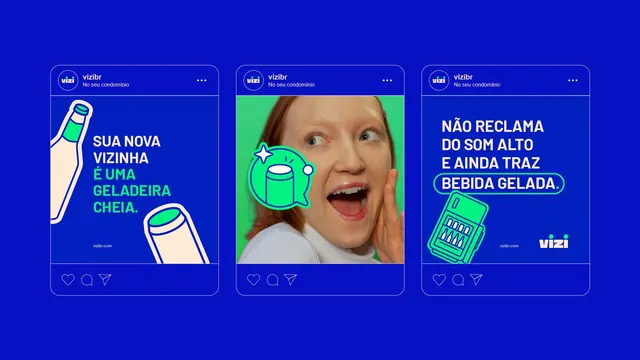
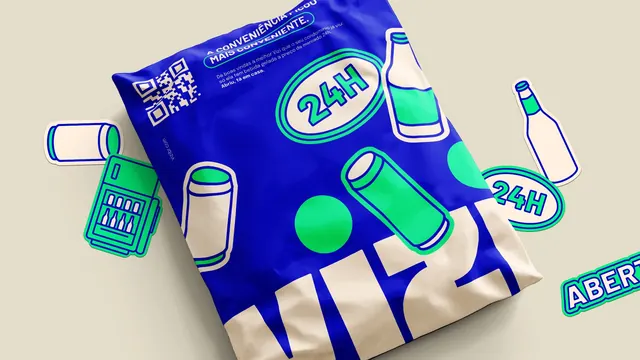
The ground is a flat warm peach that never changes. The loop starts empty, then a large glass-fronted drinks cooler icon lands at the lower left, followed by a tilted rounded rectangle badge reading "ABERTO" in bold all-caps and a coin carrying a dollar sign with a small star beside it. More pieces cascade in from different edges at staggered intervals: a bottle at an angle, an aluminium can, a tall upright fridge, a phone or slim vending unit whose screen shows the same rows of bottles, an oval badge reading "24H", a ticket-shaped tag with a percent sign, and a small gift or bow shape at the far left. Every icon uses the same treatment, a solid mint green silhouette with a thin blue keyline halo and blue interior detail lines standing in for shelves, labels and bottle necks; strokes are uniform and corners are generously rounded. At peak the field is dense enough that icons overlap and crop against the edges. The elements then leave in roughly reverse order until only the cooler and the "ABERTO" badge remain, and finally the peach field is empty again.
Key takeaway
Two colours plus one keyline weight is enough to make a large icon family cohere, even when the subjects range from a fridge to a percentage tag. Building the words into the set as badge shapes rather than captions means the copy behaves like an icon and can be scattered with the rest.
Reuse notes
Good reference for a retail or convenience brand that needs a wide illustrative vocabulary for packaging, app empty states and store signage. The staggered entrance is worth stealing for a loading or onboarding screen. The mint on peach combination is low contrast for small sizes, so the blue linework has to stay for legibility; do not drop it to simplify the icons.