Preview image. Unlock full-res
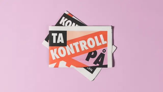
Overlapping Norwegian-language printed cards with "TA KONTROLL PÅ" (Take Control) messaging arranged at dynamic angles on a soft pink background.
Summary
A dynamic collage of overlapping printed cards in Norwegian, prominently featuring "TA KONTROLL PÅ" (Take Control) text across an orange diagonal stripe, layered at sharp angles against a soft pink background.
Visual description
Multiple rectangular printed cards in black, cream, and orange arranged at tilted angles creating visual depth. A large orange diagonal stripe carries white text reading "TA KONTROLL PÅ" in bold sans-serif. Additional cards show Norwegian typography in black and white, positioned to overlap and suggest motion. The composition plays with angular geometry and text hierarchy, using the warm pink background to frame the arrangement. Cards include elements of typography-heavy design with high contrast text treatment.
Key takeaway
Layered typography and overlapping angled cards create visual rhythm and movement without imagery. The interplay between bold horizontal text and tilted card placement draws the eye through the composition dynamically.
Reuse notes
Strong approach for campaign collateral, printed media systems, or editorial layouts where Norwegian language and bold typography are assets. The angular overlap technique works well for event identities, publications, or brand systems emphasizing energy and forward motion. Best suited for contexts where text is prominent and geometric layering complements the messaging.
More like this
Keep what you find
A free account saves references to boards and can send you a weekly email of picks based on what you save.
To see every result, go Pro.