Preview image. Unlock full-res
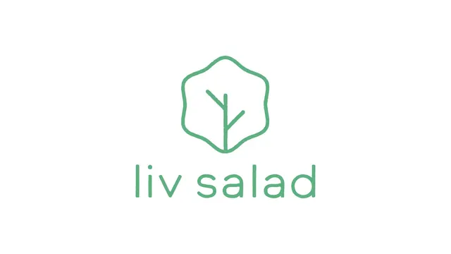
A short loop that cycles through five green single-weight line icons from a salad brand's identity kit on a pale grey field.
More like this
See all
Summary
A five-frame loop that steps through a set of mid-green outline icons, one per frame, each centred alone on the same pale grey ground so the set reads as a single consistent system rather than five separate drawings.
Visual description
The background never changes: a flat, very light warm grey. Each frame swaps in one icon, drawn in a soft mid green at a constant stroke weight with rounded corners and slightly wobbling, hand-drawn contours. The sequence runs through a squeeze bottle beside a small carafe, a filled salad bowl with leaves cresting over the rim and a plate line beneath it, a wobble-edged badge containing the word VEG in spaced all-caps sans, the same badge shape holding a bare sprig or twig, and finally a tall tumbler beside a shorter glass, each with a wavy fill line near the top. The icons hold the same optical size and the same centre point, so the cut between them lands as a clean swap with no drift or scaling.
Key takeaway
The constancy is the whole trick: one stroke weight, one green, one canvas position, one wobble in the contour. Because nothing else moves, the loop reads as a catalogue of the brand's vocabulary rather than as an animation. The wobbled outline keeps a strictly geometric icon set feeling handmade and food adjacent.
Reuse notes
Good reference for presenting an icon library as motion in a case study, a loading state, or a looping section on a menu screen. It relies on every icon being drawn to the same optical weight and bounding box, so audit the set before animating. The single-green-on-grey pairing is quiet by design and will need a stronger accent elsewhere in the system to carry a full identity.