Preview image. Unlock full-res
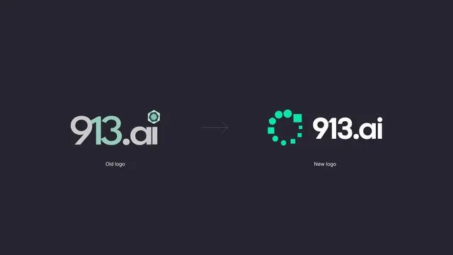
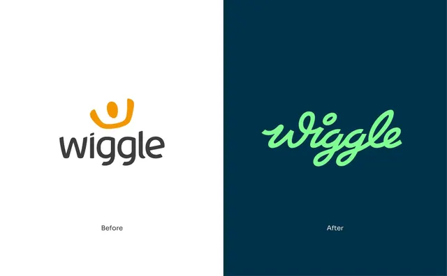
Split-panel rebrand comparison putting the old orange smile-mark logo on white against the new green script logotype on navy.
More like this
See all
Summary
A hard vertical split showing the retired logo and its replacement at matching optical size, each centred in its own half with a small "Before" and "After" label below.
Visual description
The frame is divided down the middle. The left half is white and holds the old mark: a rounded lowercase "wiggle" in dark charcoal with a soft, slightly handwritten sans, sat under an orange arc that curves like a smile with a filled oval inside it, reading as an eye and a grin. The right half is deep navy and holds the new mark: "wiggle" set as a single continuous monoline brush script in pale mint green, with generous loops on the double-g descenders and a detached dot over the i. Both marks are centred in their halves at the same optical width, sitting slightly above centre. Under each, in small grey and small white respectively, sit the words "Before" and "After" in a plain sans. Nothing else is in frame.
Key takeaway
Matching the two marks on optical width and vertical position, then letting the background colour flip carry the change, makes the comparison about form rather than presentation. Swapping a symbol-plus-wordmark for a single script that carries both the name and the personality is the actual argument, and putting it on navy instead of white is what signals a whole new palette without showing one.
Reuse notes
Useful as a case-study opener or a stakeholder slide when the rebrand needs to be defensible in one frame. The format is only honest when both marks are shown at the same size; scaling the new one up quietly stacks the deck. Works best when the two logos differ in construction, not just in colour.