Preview image. Unlock full-res
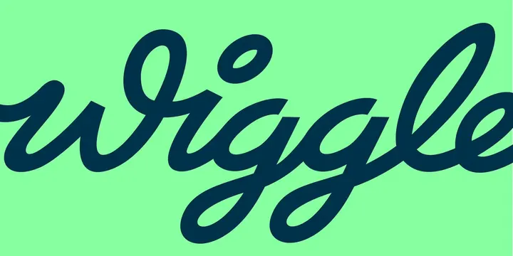
Oversized crop of the Wiggle script logotype in navy on flat mint green, cut off at both edges so only the middle of the word is legible.
More like this
See all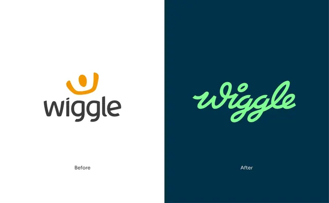
Summary
The script logotype blown up far past the frame so it bleeds off both sides, reduced to two flat colours and read as pure letterform rather than as a logo.
Visual description
A flat mint-green field carries the word "wiggle" in deep navy, set as a single continuous monoline brush script. The scale is extreme: the word is cropped hard at the left, losing the entry stroke of the w, and cropped at the right through the final e, so the composition sits on the connected middle of the word. Stroke weight swells and thins the way a broad brush would, with the thickest points at the bottom of each bowl. The double g descenders drop into long open loops that cross each other below the baseline and account for most of the lower half of the frame. The dot over the i is a detached tilted oval. Nothing else is in the frame: no mark, no strapline, no rule, only the two colours.
Key takeaway
Cropping a wordmark until it is no longer readable as a name is a way to spend a logo as a graphic asset, and it works here because the script's crossing descenders are distinctive enough to identify the brand on their own. Two flat colours and no background texture keep the focus entirely on stroke rhythm.
Reuse notes
A good pattern for endpapers, packaging sides, tote prints, cover frames or any surface where the full lockup already appears elsewhere in the sequence. Do not use it as a primary identification; it only reads if the audience has already met the full logotype. Needs a script with genuine stroke modulation, since a constant-width monoline flattens out at this scale.