Preview image. Unlock full-res
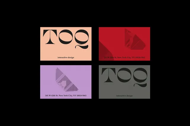
A design studio identity system featuring deep black backgrounds, warm mauve-pink typography, and deep red accents.
Summary
A branding system for an interactive design studio showcasing a sophisticated palette of near-black, dusty rose-mauve, and deep crimson red with clean typography-forward layouts.
Visual description
The composition uses a dominant dark charcoal background (near black) as the canvas. Warm mauve-pink text and design elements occupy the middle ground, providing soft contrast against the darkness. A striking deep red accent color (#AB1521) is used sparingly for emphasis and hierarchy. The overall treatment is minimalist and sophisticated, relying on typography and negative space rather than imagery.
Key takeaway
The restraint in the color palette and the boldness of letting typography breathe on dark. The warm rose-mauve mid-tone creates a distinctly premium feel against the black without pushing into loud color territory.
Reuse notes
Excellent reference for B2B branding, design industry identity systems, and luxury positioning. Works well for studios, agencies, and creative firms that want to position as sophisticated and intentional. The mauve-pink on black is memorable and contemporary while remaining professional.
More like this


Keep what you find
A free account saves references to boards and can send you a weekly email of picks based on what you save.
To see every result, go Pro.