Preview image. Unlock full-res
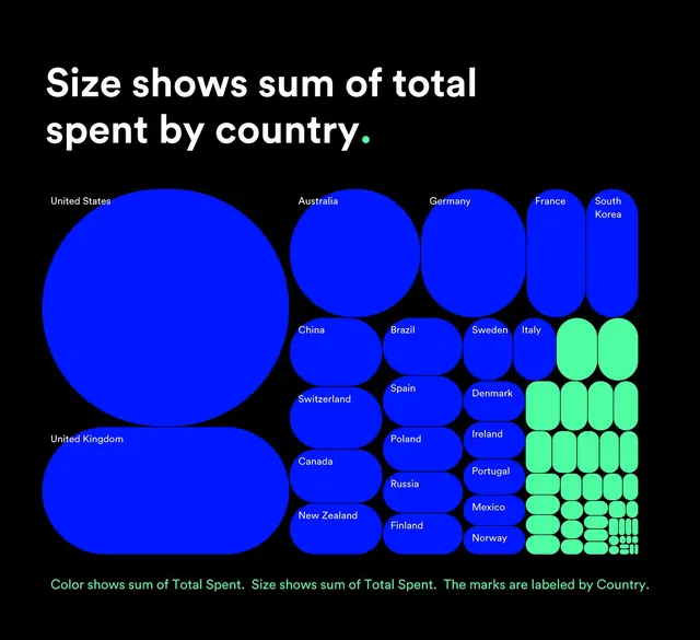
This is a data visualization using proportional circle sizes to represent monetary amounts spent by different countries.
Summary
This is a data visualization using proportional circle sizes to represent monetary amounts spent by different countries.
Visual description
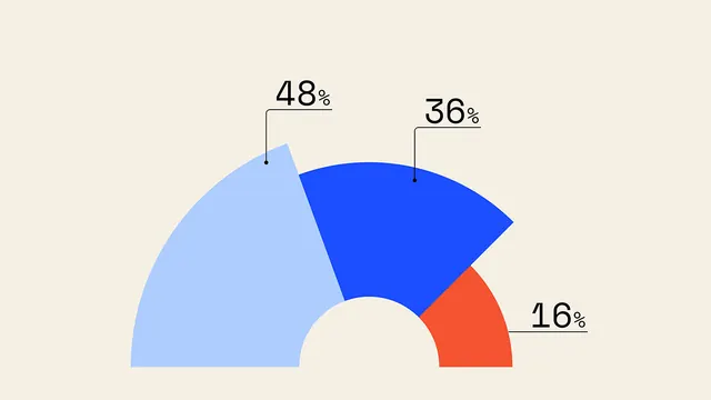
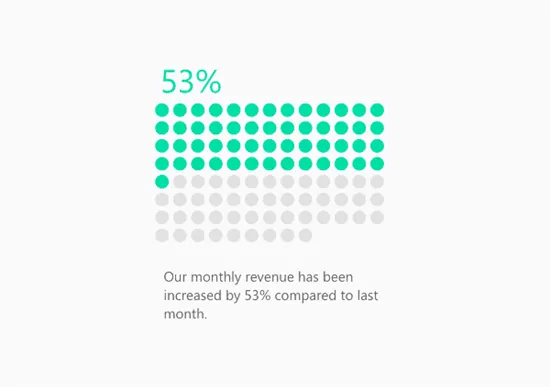
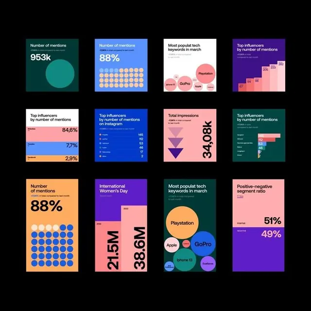
This is a data visualization using proportional circle sizes to represent monetary amounts spent by different countries. The design is clean, modern, and relies heavily on color variation to convey magnitude, creating a clear comparative chart. The layout is a grid-like arrangement of various sized circles distributed across the frame, emphasizing size as the primary variable. The text is simple and sans-serif, used for the title and labels, maintaining a clean, functional aesthetic.
Key takeaway
An infographic reference. Worth saving for its data visualization, infographic, circular chart treatment.
Reuse notes
Fits fintech work.
More like this



Keep what you find
A free account saves references to boards and can send you a weekly email of picks based on what you save.
To see every result, go Pro.