Preview image. Unlock full-res
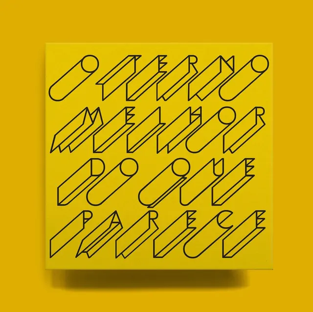
Geometric poster with isometric line-drawn text on vibrant golden yellow background.
Summary
A vibrant yellow poster featuring Portuguese text rendered in geometric isometric letterforms with thin black outlines.
Visual description
The composition is a perfect square filled with rich golden yellow. The text, arranged in four lines, reads "OUTERNO MELHOR DO QUE PARECE" and is rendered in a distinctive isometric style with each letter drawn using thin black strokes to create a three-dimensional effect. The letters appear to recede in perspective, giving the typography dimensional depth. White negative space surrounds the central text block. A subtle drop shadow appears beneath the text panel, suggesting it sits slightly off the yellow background.
Key takeaway
Isometric typography transforms flat text into sculptural letterforms through perspective alone. Monochromatic color combined with geometric precision creates sophistication and visual impact without pattern or imagery.
Reuse notes
Excellent for editorial, music, event, or cultural design. The bold isometric approach works well for posters, album covers, or book covers. The monochromatic treatment on a single strong color is striking and print-friendly.