
Preview image. Unlock full-res
A 32-slide digital-product-design studio capabilities deck built on a strict black / white / electric-blue system, oversized grotesque headlines, monospaced utility labels, and a repeated services-and-case-study template.
Summary
A 32-slide capabilities deck for Refresh Studio, a Johannesburg digital product design studio. Its personality comes from a disciplined three-state system: mostly white and near-black slides punctuated by full-bleed electric-blue statement breaks, all set in one oversized grotesque sans with tiny monospaced utility labels.
Visual description
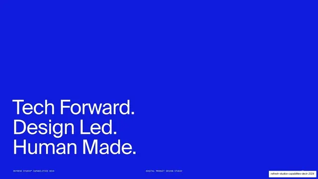
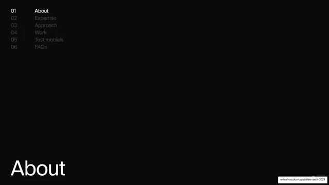
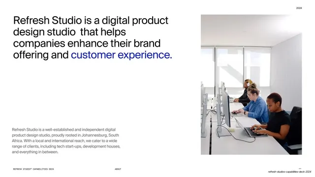
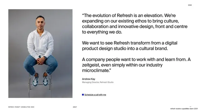
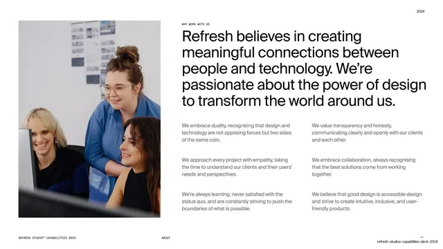
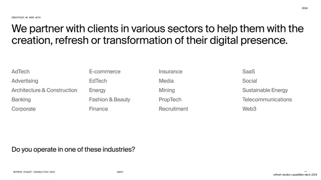
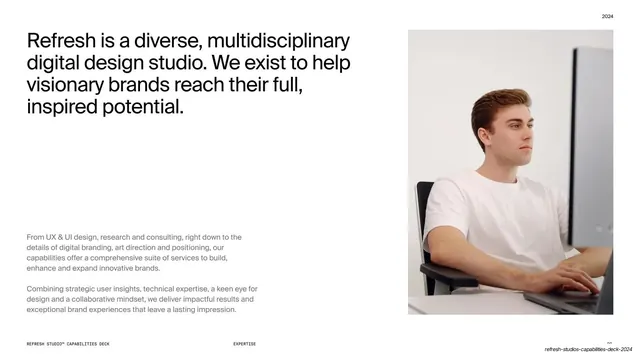
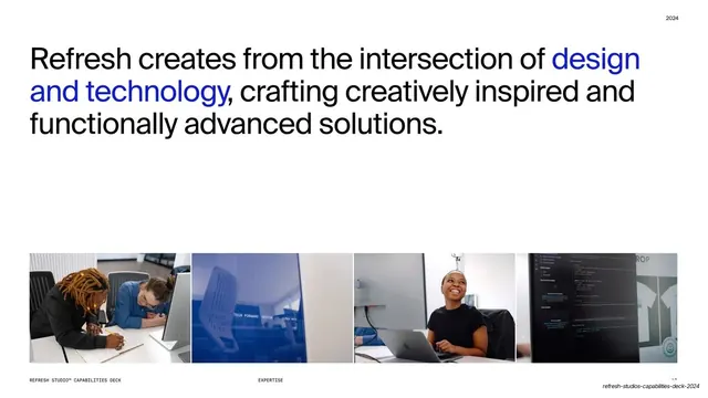
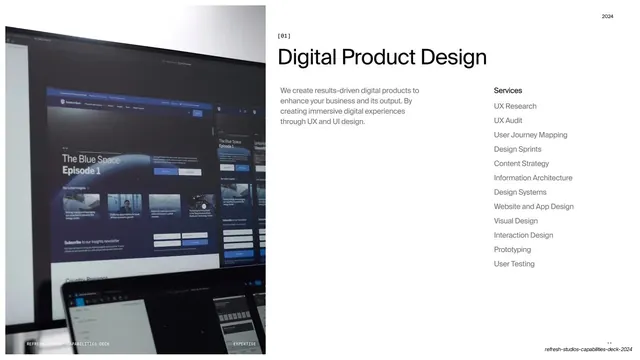
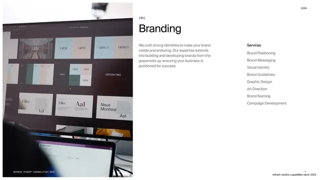
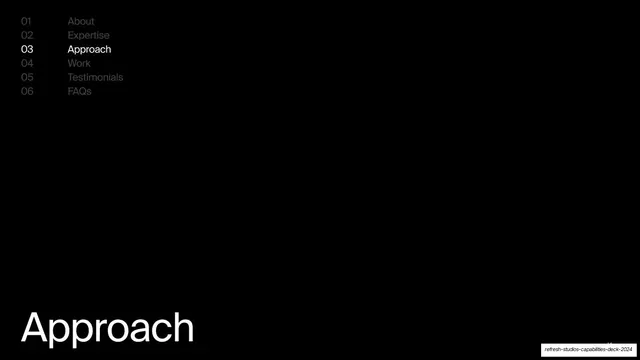
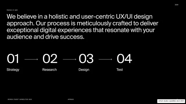
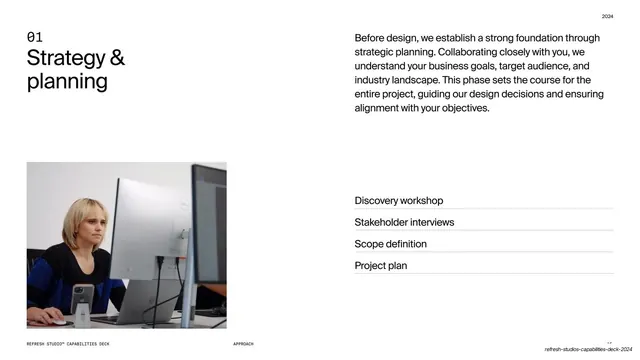
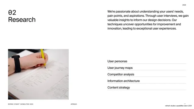
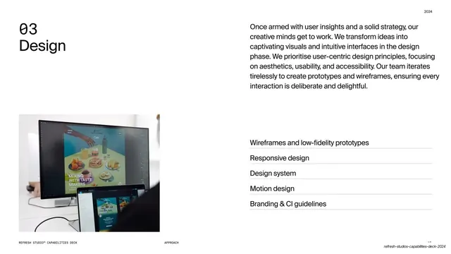
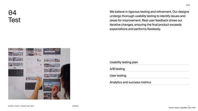
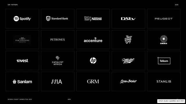
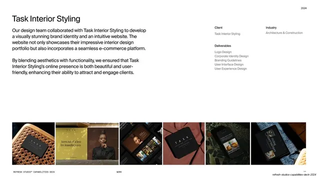
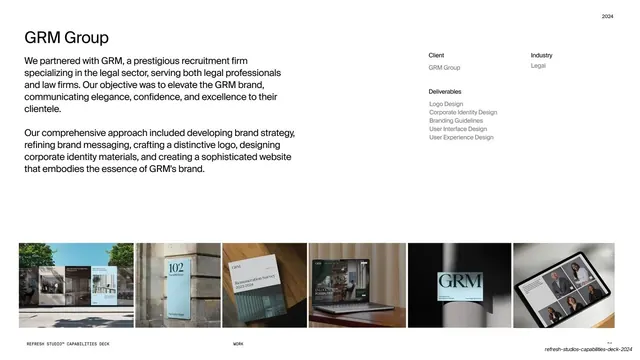
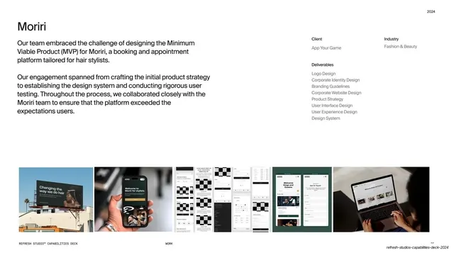
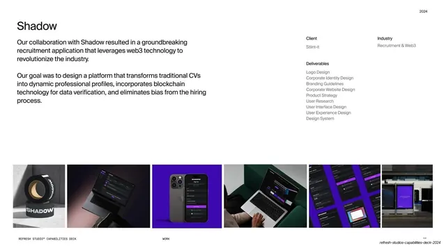
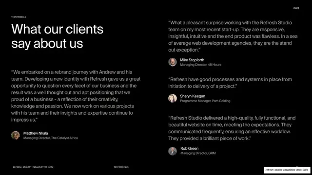
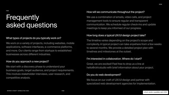
Slides run 16:9. The palette is strict: pure white, near-black, and a single saturated ultramarine blue used both as a full-bleed background and as an inline accent inside black or white headlines. Headlines are an oversized neo-grotesque sans (Helvetica-like) set tight; body copy is the same family at a calm reading size; a small monospaced face carries running header and footer labels in all-caps (REFRESH STUDIO CAPABILITIES DECK left, the section name centered, a "2024" or DIGITAL PRODUCT DESIGN STUDIO marker right, plus page numbers). The "refresh" wordmark is a custom lowercase grotesque with squared terminals and a TM mark. Recurring grammar across the deck: a numbered section-contents page (01 About through 06 FAQs) that highlights the current section while greying the rest, with the section title set huge at the bottom-left; full-bleed blue statement slides carrying one large quote-like sentence; split text-left / image-right "about" slides; a horizontal four-step process row (01 Strategy, 02 Research, 03 Design, 04 Test) with arrows; a five-by-four black logo wall of client marks in boxed cells; two-column service slides ([01] Digital Product Design, [02] Branding) with a body paragraph and a right-hand Services list; a strict case-study template (large client name, two body paragraphs, a right-hand Client / Industry / Deliverables meta block, and a full-width five-image mockup strip across the bottom); a two-column testimonial wall with avatar, name and role; and a two-column FAQ page. Photography is bright, natural-light studio and workplace imagery; product work appears as device and print mockups in the case-study strips.
Key takeaway
The restraint of a single accent color used two ways, as both a full-bleed mood break and an inline highlight inside otherwise black-on-white type, so the whole deck reads as one system. The numbered contents page that repeats before each section and re-highlights the active item is a clean, low-effort wayfinding device. And the case-study template (client name, copy, Client/Industry/Deliverables meta column, bottom image strip) is a tidy, repeatable pattern that keeps every project page consistent.
Reuse notes
A strong reference for agency, studio, and B2B service or capabilities decks, and for any long deck that needs to stay legible and on-system across 30-plus slides. The contents-page wayfinding, the full-bleed color statement break, the process row, and especially the case-study meta-and-strip template are directly liftable. Depends on good natural-light photography and clean device mockups to carry the image-heavy slides; the all-monospace utility labels and single ultramarine accent are what hold the minimal layout together, so keep both if you borrow the structure.
From this deck: Refresh Studio Capabilities Deck 2024
View deck





More like this







Keep what you find
A free account saves references to boards and can send you a weekly email of picks based on what you save.
To see every result, go Pro.