Preview image. Unlock full-res
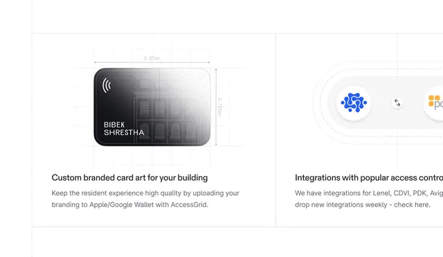
Technical product mockup showing a wireframe access card design overlaid with dimension markers, paired with integration partner logos and explanatory copy.
Summary
Technical mockup of a rounded-rectangle access card with dimension annotations and adjacent reference logos, demonstrating product integration partnerships and physical specifications.
Visual description
Left side shows a card mockup with a dark gradient left edge, white right edge with crosshatch pattern, and overlaid dimension callouts (3.37 inches wide, 2.125 inches tall). The card displays "BIBEK SHRESTHA" and a wireless icon. A light grid background underscores the technical documentation style. Right side displays integration partner logos including a blue network icon and gold square icon, with partial text cut off. Callout text below identifies custom branding capability and lists integration partners (Lenel, CDVI, PDK, Avigilon). Clean sans-serif typography in dark gray and black on white background.
Key takeaway
The dimension-marker style for product spec communication; the two-column layout separating the artifact (left) from context or partners (right); the minimal line-based grid conveying precision and engineering discipline.
Reuse notes
Use for fintech or security product specs, API documentation, or hardware capability sheets. Works well paired with integration galleries. The light/dark gradient on the card itself adds depth without visual noise.
More like this


Keep what you find
A free account saves references to boards and can send you a weekly email of picks based on what you save.
To see every result, go Pro.