Preview image. Unlock full-res
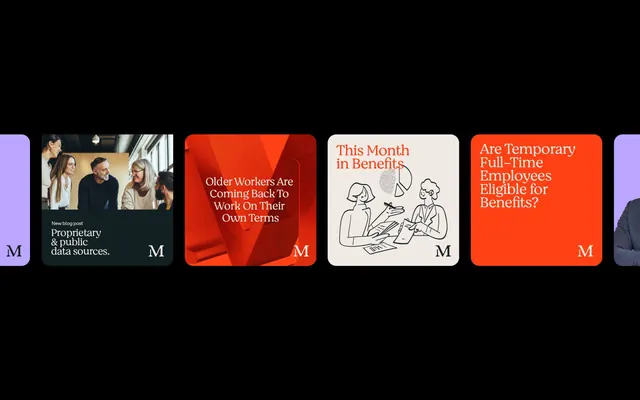
An HR/benefits informational layout using five rounded-corner cards in high-contrast black, bright orange, cream, and lavender tones with photography, line illustration, and bold headlines.
Summary
A corporate HR layout presenting five information cards in high-contrast blocks: orange, cream, lavender, and black with photography, line art, and bold headlines spelling out individual benefits topics.
Visual description
Horizontal composition of five rounded-corner cards against a black background. From left: a dark card with lifestyle photograph of four office workers (warm wood interior) overlaid with serif "New blog post" callout and sans-serif "Proprietary & public data sources" headline. Center-left: bright orange geometric background with white serif headline "Older Workers Are Coming Back To Work On Their Own Terms". Center-right: cream card with black-line illustration showing three figures around a table and serif headline "This Month in Benefits" in orange. Far right: bright orange card with white sans-serif headline "Are Temporary Full-Time Employees Eligible for Benefits?" Dark card edges are barely visible at far left and right. Each card carries a faint "M" logo mark in the corner. The high-contrast palette (black ground, orange, cream, lavender accents) ensures rapid visual scanning and clear content separation.
Key takeaway
High-contrast modular cards make complex information digestible. Alternating photography and illustration prevents visual monotony. The signature bright orange on black creates urgency and prominence without overwhelming. Sans-serif headlines paired with serif subheads create clear hierarchy. Rounding card corners softens the modular grid while maintaining clarity.
Reuse notes
Essential for HR, corporate communications, employee benefits presentations, and internal blogs. The modular structure scales to any number of cards. Works across digital and print when color contrast is preserved. The warm photography and clean illustration styles feel accessible and human rather than cold corporate. Best when each card represents one distinct topic or benefit.
More like this





Keep what you find
A free account saves references to boards and can send you a weekly email of picks based on what you save.
To see every result, go Pro.