Preview image. Unlock full-res
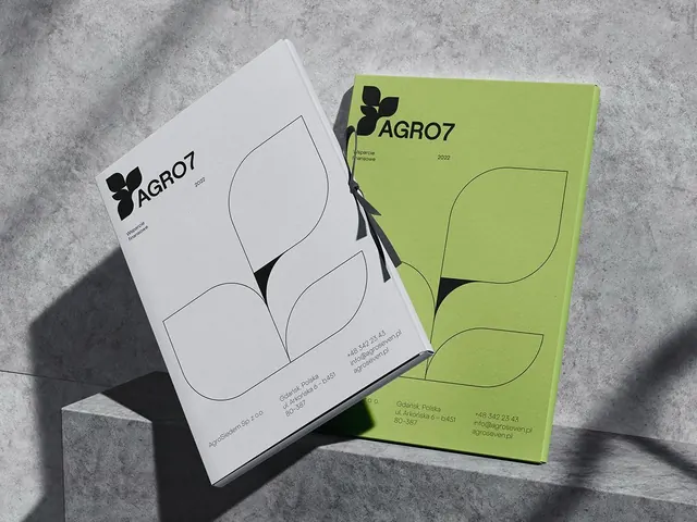
Two-color brand identity for agricultural company AGRO7, using white and lime-green folded brochures with bold leaf iconography on concrete backdrop.
Summary
Agricultural brand identity for AGRO7 using a bold two-color system: lime green and natural white with hand-drawn leaf forms creating a modern, eco-conscious botanical mark.
Visual description
Two folded brochure mockups arranged at asymmetric angles on a textured concrete surface, capturing dramatic diagonal sunlight. Left piece on white stock features the AGRO7 logo and a large organic leaf outline; right piece on lime-green stock shows the same leaf form reversed. The logo combines a bold four-leaf clover/plant mark with sans-serif wordmark. Contact information and 2022 date appear on the green piece. The composition creates visual rhythm through color blocking and the repeated leaf geometry, with strong shadows emphasizing dimensionality.
Key takeaway
The two-color system drives entire identity without secondary hues. The leaf form is simple enough to scale from logo to packaging but distinctive enough to own the brand. The mockup angle and concrete setting give the identity credibility without fancy photography.
Reuse notes
Strong for agricultural, food, sustainability, and eco-product brands. The white-plus-one-bright-color approach scales to digital, web, and print without complexity. Consider if your audience reads "organic/natural" from leaf imagery alone.
More like this




Keep what you find
A free account saves references to boards and can send you a weekly email of picks based on what you save.
To see every result, go Pro.