Preview image. Unlock full-res
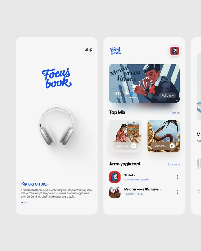
A two-panel mobile UI for a media streaming app combining a product-focused sidebar with a card-grid feed of curated content.
Summary
A two-panel mobile UI for a Cyrillic-language streaming platform pairing a left sidebar showcasing a product (headphones) and branding with a right feed of curated playlist cards and user recommendations.
Visual description
The left panel features a large blue script wordmark ("Focus book") with a centered product photograph of white over-ear headphones and Cyrillic copy below. The right panel displays a scrollable feed of video/audio content cards: a large featured tile labeled "Мейіі Кобка" with a preview image and stream count, followed by two smaller square tiles in a grid, then a titled "Top Mix" section, and below that a user-recommendation block labeled "Апта үздіктері" listing app icons and release dates. Soft rounded corners on all card elements, navigation "Skip" label visible at top. Overall light gray background with white cards and blue accent type.
Key takeaway
The left-right split cleanly separates product identity and discovery, letting two visual stories coexist in one viewport. The card-grid feed balances featured and secondary content with size hierarchy. Soft shadows and rounded corners maintain a friendly, contemporary feel.
Reuse notes
Effective for media/streaming product pages or two-column mobile layouts balancing branding with content browsing. Works well when you have a distinct product hero to anchor the sidebar. Note the Cyrillic typography; adapt font families for other scripts.
More like this

Keep what you find
A free account saves references to boards and can send you a weekly email of picks based on what you save.
To see every result, go Pro.