Preview image. Unlock full-res
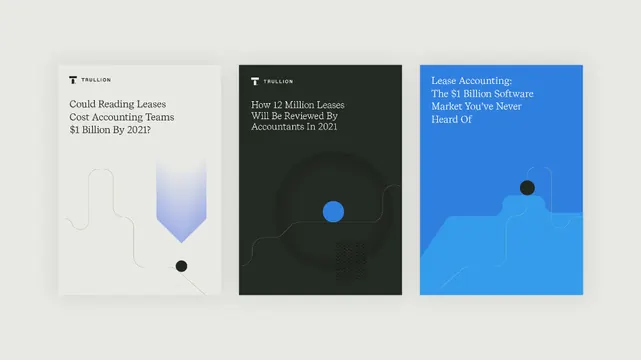
Three article preview cards for an accounting SaaS: light beige, dark navy, and bright blue, each with serif headline, abstract organic-geometric element, and text logo.
Summary
Three article preview cards for an accounting SaaS: light beige, dark navy, and bright blue, each with serif headline, abstract organic-geometric element, and text logo.
Visual description
A horizontal three-column grid, each card with distinct background: light cream-beige (left), charcoal-black (center), bright royal-blue (right). Each card features the Trullion logo (sans-serif mark) anchored in the top-left corner. The headlines are set in serif typeface in white on dark/blue backgrounds, cream on light. Below the headline, each card contains a unique abstract element: left shows subtle outlined organic shapes (curved brackets), center shows a small bright-blue circle floating in a minimal geometric framework, right shows a solid dark circle and faint wavy line. The overall effect is clean and pattern-driven, relying on high contrast between background colors rather than ornamentation.
Key takeaway
The three-card pattern using distinct background colors (light, dark, bright) to create visual separation without borders. The consistent placement of logo, headline, and a single small abstract element creates a scalable template. The pairing of serif headlines with abstract geometric elements that stay minimal and iconic rather than literal. The use of a bright accent color (blue circle, blue background) that reads as actionable against neutral neighbors.
Reuse notes
Strong template for fintech, SaaS, or B2B article/resource landing pages. The three-column grid scales down well to two-column on mobile. Works best when the three cards have thematic or visual contrast. The serif + sans-serif pairing leans corporate-clean; reuse the grid for case studies, blog teasers, or feature comparisons.
More like this





Keep what you find
A free account saves references to boards and can send you a weekly email of picks based on what you save.
To see every result, go Pro.