Preview image. Unlock full-res
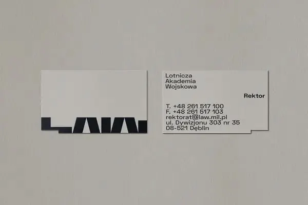
Business card pair for a legal practice, pairing oversized sans-serif wordmark 'LAW' with a minimal contact information card on neutral linen stock.
Summary
A pair of coordinated cards for a legal or institutional body, pairing a monumental sans-serif wordmark with a disciplined contact-information grid on neutral linen.
Visual description
Two business cards lie flat on a textured light-grey linen background. The left card is a full-bleed identity piece: oversized sans-serif "LAW" in solid black sits low in the composition, anchored near the bottom edge. The right card is a classic horizontal layout holding a tight stack of contact lines (name, title, phone, fax, email, address) in small sans-serif black type. Both cards use the same cream or off-white stock. The overall composition uses extreme negative space and absolute geometric discipline: no flourishes, no color, just type hierarchy and contrast.
Key takeaway
The asymmetric card pair: one card is pure identity (the mark, large and alone), the second pure information (dense but well-spaced contact data). This separation of roles scales well. The minimal linen texture grounds a stark typographic system without breaking the institutional formality.
Reuse notes
Ideal for legal practices, academic institutions, government offices, or any organization that trades on gravitas and restraint. The scale of the wordmark demands a premium stock and thick printing; works best on thick cream or warm white card stock (150–300 gsm). Not suitable for retail or consumer brands; the coldness and density signal formality.
More like this






Keep what you find
A free account saves references to boards and can send you a weekly email of picks based on what you save.
To see every result, go Pro.