Preview image. Unlock full-res
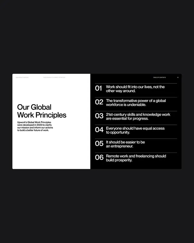
Two-column manifesto layout with a white descriptive panel on the left and a numbered list of six principles on a dark background, using bold sans-serif and generous spacing.
Summary
Two-column manifesto layout with a white descriptive panel on the left and a numbered list of six principles on a dark background, using bold sans-serif and generous spacing.
Visual description
Left panel: white background with large bold sans-serif headline (no size hierarchy, just weight), followed by a four-line paragraph of supporting body copy, all in black. Right panel: solid dark background (nearly black) with a "TABLE OF CONTENTS" label in small caps, then six numbered principles (01 through 06) in white text. Each principle is a one-to-two-line statement. The numbers are large and evenly weighted in bold sans-serif; the text is light-weight and sits flush-right relative to the numbers. The entire composition is perfectly symmetrical in two-column layout, with equal visual weight on both sides. No accent colors, no imagery.
Key takeaway
The numbered-and-right-aligned text structure for creating perceived hierarchy without size variation. The balance of a text-heavy left with a dense but spacious-feeling right column. The discipline of using one typeface and only weight variation (bold for numbers, regular for content) to avoid chaos at large scale.
Reuse notes
Ideal for corporate manifestos, strategic positioning documents, sustainability reports, and value-proposition slides. The format reads as formal and serious; suits B2B and consulting contexts. Works well when the principles are 2-4 words or a short declarative sentence. Would not pair well with imagery or color accents, as the stark contrast is the entire effect.
More like this






Keep what you find
A free account saves references to boards and can send you a weekly email of picks based on what you save.
To see every result, go Pro.