Preview image. Unlock full-res
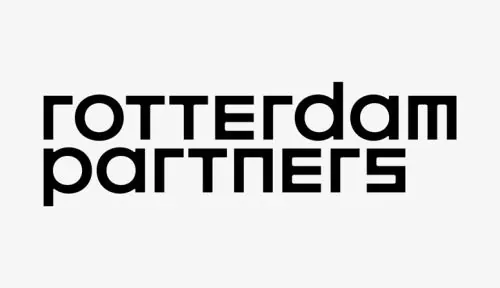
Two-line stacked wordmark in large sans-serif caps with minimal letter-spacing, neutral palette, strong typeface weight.
Summary
Two-line stacked wordmark in large sans-serif caps with minimal letter-spacing, neutral palette, strong typeface weight.
Visual description
The wordmark "rotterdam partners" is set in all capitals across two lines ("rotterdam" / "partners"), using a bold geometric sans-serif with consistent stroke weight and tight spacing. Letterforms are clean and uniform, with open counters. The palette is strictly black on white (light gray background), offering maximum contrast for reproduction at any scale. No additional ornamentation, color, or illustrative element.
Key takeaway
The discipline of a purely typographic identity with no flourishes. The generous letterform weight paired with tight spacing creates immediate authority and presence. The two-line stacking is memorable and works equally well horizontal and vertical.
Reuse notes
Ideal template for any b2b services wordmark (consulting, partnerships, advisory, investment). The high contrast ensures legibility in small applications (letterhead, web favicons, reduced signage). Works strongest when paired with a clear, distinct typeface specimen and minimal additional branding.
More like this


Keep what you find
A free account saves references to boards and can send you a weekly email of picks based on what you save.
To see every result, go Pro.