Preview image. Unlock full-res
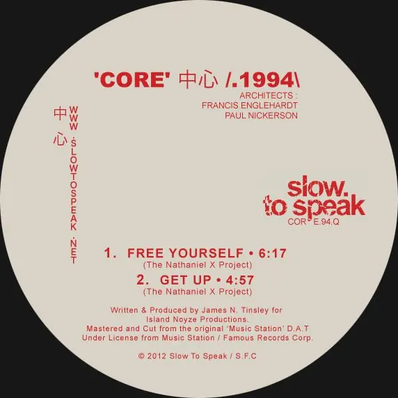
Music label release with bold red typography on cream circular background, featuring both Latin and Chinese characters in a structured, gridded composition.
Summary
A cream-background circular album cover using bold red typography and grid-based layout to balance Latin and Chinese text, credits, and track information for a music production label.
Visual description
Cream or off-white circular ground on black background. Large bold red sans-serif "CORE" with Chinese characters (心) centered at the top. Smaller red credits (ARCHITECTS, FRANCIS ENGELHARDT, PAUL NICKERSON) aligned below. Left edge: vertical red text in mixed Latin/Chinese characters arranged in tight columns. Center-right: two-line "slow to speak" in large bold red sans-serif with small trademark and code. Bottom third: two numbered tracks in red (1. FREE YOURSELF, 2. GET UP) with production notes, copyright symbol, and licensing info in tiny red type. All text is left-aligned or grid-aligned.
Key takeaway
The contrast of large display typography against cream background (high legibility with warmth). The bilingual text treatment balancing Latin and character-based scripts in a single grid without visual chaos. The use of a single accent color (red) doing all the visual heavy lifting.
Reuse notes
Works well for music projects, publishing, and design education contexts. The cream/tan with red pairing is warm and approachable rather than institutional. Avoids pastels or trends by relying on classic vinyl-era color harmony.
More like this
Keep what you find
A free account saves references to boards and can send you a weekly email of picks based on what you save.
To see every result, go Pro.