Preview image. Unlock full-res
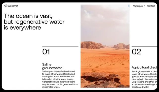
Web page for Wacomet (water/resource company) using a split layout with large desert landscape photo and two-column text blocks explaining water-regeneration methods, numbered 01 and 02.
Summary
A minimal web page header using a split layout with a large desert landscape photograph occupying the right half, paired with an oversized display headline on the left ("The ocean is vast, but regenerative water is everywhere") and two numbered text blocks below explaining saline groundwater and agricultural discharge methods.
Visual description
Black border frame containing a web interface. Top navigation shows "Wacomet" logo on the left, "WaterDAO" link and "Contact" on the right. Below, the headline in large, dark sans-serif breaks across three lines on the left. To the right is a landscape photograph: arid, sandy terrain with distinctive reddish-brown rock formations under a pale, cloudy sky, shot at mid-horizon to emphasize vastness. Below the headline are two columns, each numbered (01 on the left, 02 on the right) with subheadings "Saline groundwater" and "Agricultural discharge" in smaller sans-serif, followed by body copy explaining each method's water-regeneration process. Thin black horizontal divider lines separate each section. White background, black type, orange accents in the numeral callouts. No illustration or decoration, pure typographic and photographic minimalism.
Key takeaway
The large landscape photograph serves as the primary visual argument, allowing the headline to make its claim ("regenerative water is everywhere") via the arid context and the vastness of the terrain. Numbering the sections creates sequential reading flow without bullet points or heavy graphic elements. The display headline in large sans-serif and the small body copy below create clear type hierarchy and make scanning easy. The color restraint (white, black, orange accent) keeps focus on the message and photography.
Reuse notes
Strong for environmental consulting, water-resource, sustainability, and B2B fintech/impact brands that pair environmental imagery with clear, informational copy. The split layout (image right, text left) works well when the photograph carries emotional weight. Best on white or very light backgrounds. Reserve this pattern for content that genuinely benefits from a heroic landscape or environmental photograph; it would feel hollow with generic stock imagery.
More like this



Keep what you find
A free account saves references to boards and can send you a weekly email of picks based on what you save.
To see every result, go Pro.