Preview image. Unlock full-res
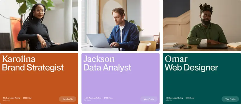
Three profile cards arranged horizontally, each with a portrait photograph, name, job title, and solid color background in burnt orange, lavender, and teal.
Summary
Three side-by-side profile cards, each pairing a portrait photograph with a name and job title on a solid background in burnt orange, lavender, and deep teal.
Visual description
Horizontal layout of three cards, each with a full-height square composition. Top half is a portrait photograph of a person in professional attire against white or neutral studio background. Bottom half is a solid color band holding the person's name in large sans-serif type (name appears as large heading, light text color) and job title below it in smaller font. Card one has burnt-orange background, card two is lavender-purple, card three is deep teal-green. Names visible include Karolina (Brand Strategist), Jackson (Data Analyst), and Omar (Web Designer). Footer area on each card has small credits or descriptive text.
Key takeaway
The triadic color blocking creates instant visual distinction across three cards without needing borders or shadows. Single solid background color per card allows photography to anchor all attention. Large justified typography treatment makes the job title function as both label and design element.
Reuse notes
Strong pattern for staff directories, agency team pages, or recruitment showcases where photos and roles need equal weight. Works best when portrait photography is consistent in framing and lighting. The three-color palette prevents monotony while staying corporate; works across HR, consulting, and creative services contexts.
More like this




Keep what you find
A free account saves references to boards and can send you a weekly email of picks based on what you save.
To see every result, go Pro.