Preview image. Unlock full-res
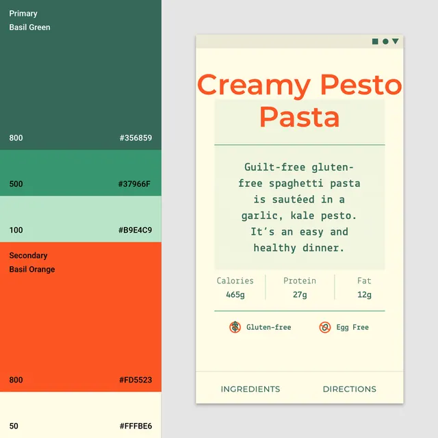
Color-coded recipe card pairing a nutrition-fact card with a linked sage-green and orange color palette specimen showing primary and secondary brand colors.
Summary
Recipe card interface showing a food nutrition label on the right paired with a color palette key on the left, using sage green, orange, and cream to establish a visual system for food or health-focused digital products.
Visual description
Two-panel layout. Left side shows a color palette key with labeled color swatches: top-to-bottom hierarchy of sage green blocks (labeled "Primary Basil Green" at top, then numbered 800, 500, 100, a bright orange block labeled "Secondary Basil Orange", and pale yellow-cream (50). Each swatch is labeled with hex value and intensity number. Right panel is a cream-background recipe card showing a recipe title "Creamy Pesto Pasta" in large rust-orange sans-serif caps. Below that is a green-tinted description box with monospace serif body copy, then a three-column nutrition stats row (calories, protein, fat with gram values). Two small circular badge icons follow (gluten-free, egg-free), then footer tabs in small caps (INGREDIENTS, DIRECTIONS). All type is clean sans-serif except the body copy which uses a serif monospace, creating visual distinction between labels and content.
Key takeaway
The split-panel layout communicating both a color system and a real-world application simultaneously. The combination of bright, warm accents (orange) with cool earthy tones (sage) feels fresh without being saccharine. The use of numbered intensity levels (800, 500, 100) and hex codes makes the palette portable. The badge system and modular card structure are reusable components.
Reuse notes
Ideal reference for health, fitness, food-tech, or nutrition-focused app design. The palette is particularly effective for organic or plant-based brands. Works well when you need to establish a cohesive design system that feels both modern and approachable. The color choices pair well with recipe, meal-prep, or wellness contexts.
More like this
Keep what you find
A free account saves references to boards and can send you a weekly email of picks based on what you save.
To see every result, go Pro.