Preview image. Unlock full-res
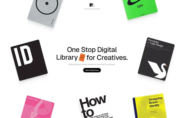
A digital product pitch for a design library using floating isometric book mockups in bold neon accents, centered sans-serif copy, and a light background to convey creative accessibility.
Summary
A SaaS marketing composition for a design library that suspends colorful book mockups (rendered in isometric perspective) around bold, centered headlines, using hot pink, electric yellow, and neon green accents against white and dark covers to signal creativity and accessibility.
Visual description
Six flat book covers float at different depths and angles around a centered typographic hierarchy. The headline reads "One Stop Digital Library for Creatives" in a bold sans-serif, with a subline below. Top left shows a gray book with a circular dial graphic; top right a neon-green card with a Nike Swoosh and "OFF"; middle left a black square carrying white sans-serif "ID"; middle right a dark book with a white swoosh logo; bottom left a hot-pink cover with psychedelic concentric patterns; bottom right a yellow cover with bold black sans-serif "Designing Brand Identity". A "View Collections" button sits beneath the headline in black on white. The white background and high contrast between the dark/light covers and vivid neon accents creates visual rhythm and depth without busy layout.
Key takeaway
The floating asymmetric arrangement creates energy while keeping the central message legible. Using product mockups (books here) at different angles and perspectives adds dimension to a flat layout. The limited, high-contrast neon color palette (hot pink, yellow, green) punches through and signals a playful, professional brand simultaneously.
Reuse notes
Ideal for marketing creative software, design education platforms, or tool aggregators targeting designers. Works because each book mockup carries visual weight and legibility even at different scales. The floating approach requires careful layering to avoid chaos; white background is almost essential to the readability. Neon accents work best on darker book covers, not on light backgrounds directly.
More like this




Keep what you find
A free account saves references to boards and can send you a weekly email of picks based on what you save.
To see every result, go Pro.