Preview image. Unlock full-res
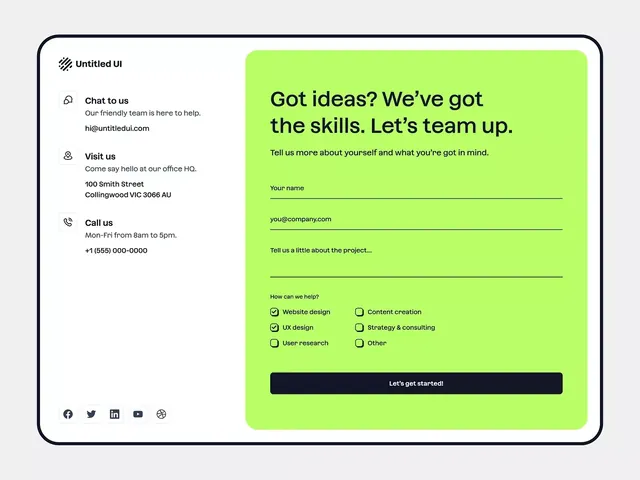
A two-column contact form splits informational sidebar against a bright lime-green form panel, using high contrast and minimal typography to guide lead capture.
Summary
A two-column contact form splits informational sidebar against a bright lime-green form panel, using high contrast and minimal typography to guide lead capture.
Visual description
Left sidebar on white background displays three icon-led contact options (Chat, Visit us with address, Call us with hours) in dark sans-serif, plus social media icons at bottom. Right panel in bright lime-green (#BAFE68) contains a form with headline "Got ideas? We've got the skills. Let's team up," followed by text input fields for name and email, a textarea for project description, and checkboxes for service type selection (Website design, UX design, User research, Content creation, Strategy & consulting, Other). Dark navy button "Let's get started!" spans full width at bottom. Border around the entire composition creates containment. White and lime-green contrast reinforces call-to-action hierarchy.
Key takeaway
The clean information architecture on the left grounds trust; the neon-bright accent panel on the right commands attention. Checkboxes for qualified-lead routing (not radio buttons) speed up longer forms. Border frame unifies two-tone compositions and prevents elements from bleeding.
Reuse notes
Works for agencies and SaaS landing pages where capturing initiative type or industry segment is part of qualification. Lime green reads energetic and youthful; swap for muted accent if brand is corporate law or finance. High-contrast background sidebars can feel heavy on mobile; test responsiveness.
More like this


Keep what you find
A free account saves references to boards and can send you a weekly email of picks based on what you save.
To see every result, go Pro.