Preview image. Unlock full-res
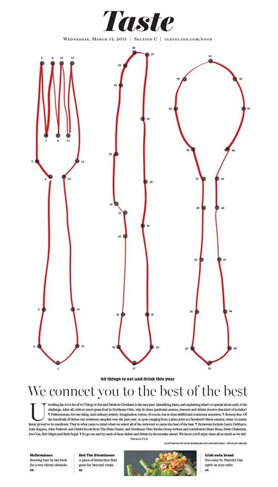
Magazine spread using anatomical fork diagrams as data visualization for dining preferences and consumer trends.
Summary
Editorial infographic presenting consumer dining data through three anatomically labeled fork diagrams, anchored by serif headline and body copy.
Visual description
A full-page magazine layout centers on three vertical fork shapes, each outlined in red with numbered anatomical reference points (like 17, 21, 33) marked in small brown dots. The forks increase in width from left to right, suggesting variation in data. Above, "Taste" sits in large italic serif type, with a subtitle citing the publication date and section. Below the diagrams, justified serif body copy begins with a large initial cap "U", followed by subheadings and three image thumbnails showing recipe or dining content. The overall palette is cream, warm gray, and dusty red on white, creating a classic editorial feel.
Key takeaway
The visual metaphor of anatomical annotation applied to consumer data is clever and memorable. The fork becomes a data container rather than mere decoration. The combination of bold geometric forms (the forks) with refined typography and justified body copy reads premium and editorial.
Reuse notes
Strong for food and lifestyle publications, beverage brands, or consumer research reports. The anatomical diagram approach works when you need to overlay data onto familiar objects. Pair with serif typography for credibility and warmth. Ensure reference points are small enough to not distract but legible in print.
More like this


Keep what you find
A free account saves references to boards and can send you a weekly email of picks based on what you save.
To see every result, go Pro.