Preview image. Unlock full-res
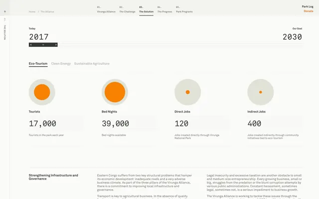
Tabbed data interface showing tourism impact metrics with orange-accented circular glyphs and modular card-based layout tracking visitors, bed nights, and employment.
Summary
A nonprofit dashboard displaying economic impact data for a national park initiative, using orange-filled circles as metric anchors against a white ground with tabbed navigation and category filters.
Visual description
The interface employs a horizontal, card-based layout across a light off-white background. At the top, a numbered tabbed navigation (01-05) with a working section indicator ("The Solution") guides to this "The Progress" view. Below, a left-hand sidebar shows the chronological range (Today: 2017, Our Goal: 2030) with a navigation slider, and three tabs for "Eco-Tourism," "Clean Energy," and "Sustainable Agriculture." The main content area presents four metric cards in a horizontal row, each containing a large circular glyph with an orange core surrounded by a pale beige ring, followed by a large numerical value (17,000; 39,000; 120; 400) and descriptive caption text. The typography hierarchy uses bold sans-serif for values and lighter weight for explanatory text. At the bottom, a full-width prose section titled "Strengthening Infrastructure and Governance" provides narrative context.
Key takeaway
The combination of simple circular glyphs with a secondary pale ring as a visual container that anchors numerical data without requiring bars or complex iconography. The effective use of orange as the only chromatic accent against a neutral palette to draw attention to specific metrics. The clean hierarchy that balances large numerical values with small descriptive text, allowing both scannability and depth.
Reuse notes
Well-suited for nonprofit annual reports, impact reports, or government transparency dashboards where you need to present multiple key performance indicators (KPIs) at a glance. The circular-glyph approach scales well for 3-6 metrics. The tabbed navigation and timeline slider work effectively when an organization needs to show progress tracking or temporal shifts. The layout assumes desktop or wide-screen viewing; may need adjustment for mobile.
More like this


Keep what you find
A free account saves references to boards and can send you a weekly email of picks based on what you save.
To see every result, go Pro.