Preview image. Unlock full-res
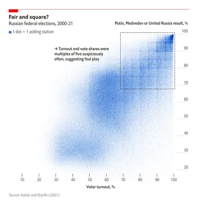
Scatter-plot heatmap showing frequency distribution of Russian historic events across a blue-to-white gradient, with axis labels and legend.
Summary
Statistical heatmap displaying the distribution of Russian historic events (1300-21) plotted on a bivariate axis system with blue intensity indicating frequency density.
Visual description
A scatter-plot heatmap on white background using a cool monochromatic blue gradient (light blue to pale blue to near-white) to show point density. The X-axis is labeled with "Date (years 1300-21)" and the Y-axis with "Kalis Pikhanderske Global Russian Index %". A small red icon or label sits above the chart title. The plot shows a clear concentration of events in the upper-left and center zones, with sparse data in corners, creating a characteristic diagonal-ish density pattern. Fine sans-serif axis labels and a legend sit below and beside the plot area.
Key takeaway
Color gradient (light to saturated blue) effectively communicates data density without harsh contrast; scatterplot with density coloring is more readable than overlapping dots; centered white space around the data makes the pattern pop; minimal axis labels keep focus on the visualization rather than decoration.
Reuse notes
Perfect for academic papers, research reports, and historical or statistical dashboards. Works well in presentations about patterns, trends, or distributions over time. The cool monochromatic palette reads as credible and scholarly. Ensure axis labels are legible at intended display size.
More like this




Keep what you find
A free account saves references to boards and can send you a weekly email of picks based on what you save.
To see every result, go Pro.