Preview image. Unlock full-res
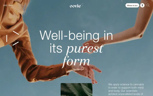
Wellness website hero featuring clasped hands over earth-tone photographic background, with mixed-serif copy highlighting 'purest form' in italic.
Summary
Oovie wellness hero pairs organic, warm-toned hand photography with split-serif/sans typography, using earth-toned blues and browns to establish trust and natural wellness positioning.
Visual description
Hero composition featuring two hands clasped in profile against a muted teal-blue background, creating a centered focal point. Overlaid white sans-serif headline reads "Well-being in its purest form" with "purest form" in italic serif to emphasize the brand promise. A horizontal menu bar with search and account icons frames the top. Below the hands sits a small dark image thumbnail (product or plant detail), suggesting additional content. The warm, organic imagery and muted color palette (teal, rust, dark browns) reinforce a natural, science-backed wellness brand identity.
Key takeaway
The italic serif accent within sans-serif body copy signals emphasis without breaking rhythm. Muted, warm color palette (teal + burnt orange) creates calm professionalism rare in wellness brands. Hand photography humanizes abstract wellness messaging.
Reuse notes
Strong hero template for direct-to-consumer wellness, cannabis, or health-tech brands. Works best when the product or core narrative benefits from human presence. Italic-serif trick works for any hero tagline.
More like this

Keep what you find
A free account saves references to boards and can send you a weekly email of picks based on what you save.
To see every result, go Pro.