Preview image. Unlock full-res
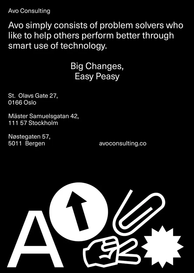
Minimalist consulting business card with monochrome palette, sans-serif type, and abstract geometric logotype combining letterforms and symbolic shapes.
Summary
A business card identity for Avo Consulting featuring a custom geometric logotype built from abstract shapes integrated with sans-serif letterforms on a pure black background.
Visual description
Black card stock with white and light gray typography and graphical marks. The layout uses left-aligned text hierarchy: company name (Avo) followed by mission statement in smaller sans-serif. Below, address and contact details align left. A custom logo mark occupies the right side: a stylized letter A combined with geometric shapes (curved form, right-angle, star burst accent) that create a unified abstract symbol. All marks are white. The overall composition is spare and confident, using full-bleed black to convey sophistication and focus.
Key takeaway
The integrated logo design treats typography and geometry as one mark rather than pairing separate lockup and symbol. This unity creates a distinctive, memorable brand presence in a tight space. Black-on-white contrast with ample whitespace (letterpress-style minimalism) communicates premium consulting authority without ornament.
Reuse notes
Ideal template for professional services branding, especially law, consulting, architecture, and finance. The monochromatic approach is production-friendly for emboss, foil, and press finishes. Scale the geometric elements carefully if adapting; they depend on the symbol's complexity to register at business card size.
More like this

Keep what you find
A free account saves references to boards and can send you a weekly email of picks based on what you save.
To see every result, go Pro.