Preview image. Unlock full-res
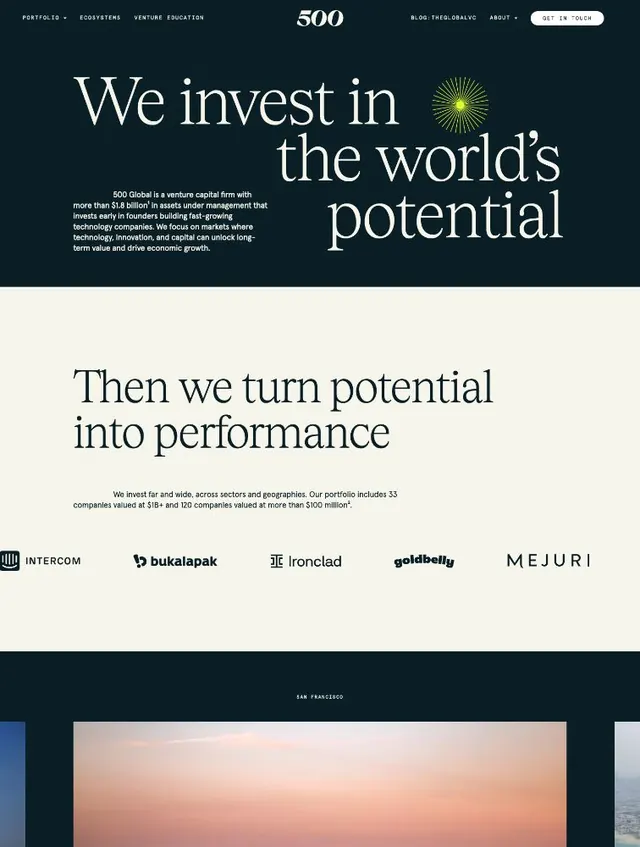
Venture capital website hero section featuring a dark navy background, large serif headline, yellow sunburst icon, and portfolio company logos below.
Summary
Venture capital website hero section featuring a dark navy background, large serif headline, yellow sunburst icon, and portfolio company logos below.
Visual description
A two-section website layout begins with a dark navy hero area containing a centered serif headline reading "We invest in the world's potential" in a large, elegant serif typeface. A small yellow sunburst icon sits to the right of the headline as an accent. Below, body copy in light sans-serif describes the firm's mission over 51.8 billion in assets. The lower section transitions to cream background. A second headline "Then we turn potential into performance" in the same serif face introduces the portfolio area. Below are rows of portfolio company logos (Intercom, Bukalapak, Ironclad, Goldbelly, Mejuri) set on a neutral background. Navigation elements (PORTFOLIO, ECOSYSTEMS, VENTURE EDUCATION, BLOG, GET IN TOUCH) sit in the header in a minimal sans-serif typeface.
Key takeaway
The pairing of elegant serif headlines against a dark background creates authority. The minimal yellow accent (sunburst) is restrained yet memorable. Logo wall below creates credibility and social proof without overwhelming the message.
Reuse notes
Effective for fintech, venture capital, and investment firm websites targeting institutional audiences. The dark-to-light transition creates visual rhythm. Serif headlines feel more established than sans-serif here, appropriate for serious financial copy. Ensure the accent color remains minimal to avoid visual noise.
More like this

Keep what you find
A free account saves references to boards and can send you a weekly email of picks based on what you save.
To see every result, go Pro.