Preview image. Unlock full-res
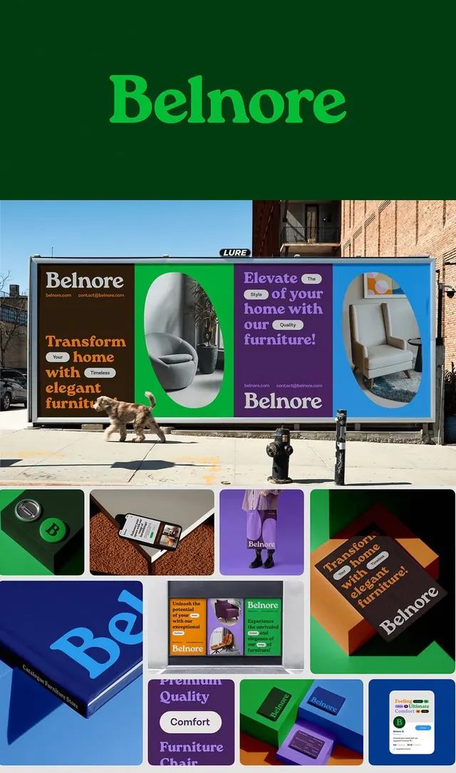
Furniture brand visual identity combining forest green, vibrant lime, purple, and blue across billboard mockup, product photography, packaging, and branded collateral materials.
Summary
A bold furniture brand system using a forest-green base with vibrant lime, purple, and blue accents across outdoor billboards, product shots, and coordinated packaging.
Visual description
Collage composition showing Belnore brand applied across multiple touchpoints. Center: a large street billboard featuring the brand name in lime green, marketing copy in orange, and circular product shots (a white toilet and a modern chair) isolated against bright colored blocks. Surrounding elements: small product lifestyle photos, a green-and-white stacked logo, purple branded boxes with "Elevate" tagline in white sans-serif, packaging detail shots with multi-color blocking, orange and green printed collateral, a small purple "Premium Quality Comfort" brand seal, and blue branded stationery. The palette moves between bold primary blocks and softer earth tones, creating visual rhythm while maintaining strong brand recognition.
Key takeaway
The confident use of multiple secondary colors (lime, purple, blue) anchored to one dark primary (forest green) without clashing. The strategy of applying brand colors as blocks and shapes rather than overall fills (keeps identity distinctive at any scale). The mix of product and lifestyle photography maintaining visual hierarchy across formats.
Reuse notes
Works for furniture, home goods, or any product brand wanting personality and energy. The bold color approach suits retail contexts where standout and shelf impact matter. Color system translates across web, print, packaging, and outdoor media.
More like this

Keep what you find
A free account saves references to boards and can send you a weekly email of picks based on what you save.
To see every result, go Pro.