Preview image. Unlock full-res
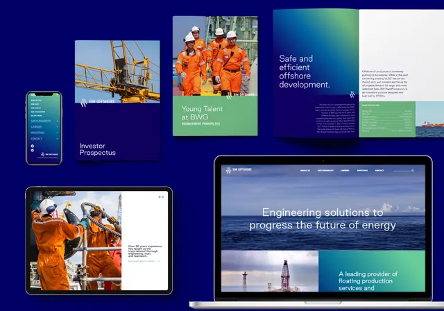
Corporate visual identity system for an offshore energy company featuring navy, emerald-green, and orange accents applied across mobile app, prospectus, tablet, and desktop interfaces.
Summary
Corporate identity system for offshore energy/oil-and-gas company applying a navy, emerald-green, and burnt-orange palette across mobile app, investor prospectus, tablet interface, and desktop dashboard mockups.
Visual description
A composite mockup displays six distinct applications of the brand across devices: a mobile phone with teal-accented app interface (top-left), a printed prospectus document titled "Investor Prospectus" featuring site photography (bottom-left), a large tablet screen showing "Safe and efficient offshore development" with hero photography and green accent panel (top-center), a white brochure page with navy headings and green sidebar (top-right), and a desktop interface showing an ocean platform with headline "Engineering solutions to progress the future of energy" and green callout panels (center-right and bottom-right). Photography of offshore platforms, workers in safety gear, and ocean scenes anchors each application. Color palette remains consistent: deep navy backgrounds, bright emerald-green callouts, burnt-orange accent cards, and white typography.
Key takeaway
The emerald-green accent used consistently across every medium creates a distinct brand anchor without requiring a full overhaul of photography or layouts. Navy backgrounds convey authority and safety, while the color system flexibly adapts whether applied to digital interface, print layout, or video. The grid-based module system allows reuse across diverse mediums.
Reuse notes
Strong template for B2B industrial, energy, or engineering brands needing to establish trust and modernity simultaneously. Works well when paired with location/asset photography. The color combination is especially effective for sectors emphasizing safety and environmental responsibility.
More like this



Keep what you find
A free account saves references to boards and can send you a weekly email of picks based on what you save.
To see every result, go Pro.